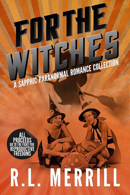
Behold For the Witches—a cover so chaotic it feels like it was summoned from the depths of a discount cauldron-themed Canva template. Where to even begin? At first glance, it’s unclear if you’re looking at a paranormal romance collection or the promotional poster for a forgotten 1950s burlesque Halloween revue. Either way, it’s trying to hex you into squinting until your retinas give out.
Let’s talk typography, because this cover certainly did… and it said, “More! Bigger! Bolder! Shadow it like it owes you money!” The title font is what happens when you give a graphic design student exactly 45 seconds to make something look “spooky and fun” using only Microsoft WordArt from 2003. The 3D extrusion effect is so dramatic it may actually have depth envy. Meanwhile, the subtitle cowers beneath it in a cramped, desperate tilt—as if trying to escape the typographic shouting match above.
The background? A blinding, orange, radioactive sunburst that looks like it was pulled straight from a Cold War-era propaganda poster. It radiates so hard you half expect the cover to peel off and slap you with anti-communist slogans. This burst of retina-burning rays doesn’t just clash with the grayscale photo in front of it—it goes to war with it.
Ah yes, the photo. Two smiling, swimsuit-clad ladies in pointy hats, looking like they just stepped out of a Betty Boop Does Salem skit. While the kitschy vintage vibe might have had promise, it’s been plopped onto the page like a leftover meatloaf—no blending, no integration, just a floating slice of sepia absurdity. They sit there awkwardly, casting no shadows and generating even less narrative cohesion.
Let’s not forget the big “TOP SECRET”-style sticker declaring all proceeds go to reproductive rights, which is a noble cause—but visually, it looks like it wandered in from a spy thriller and refused to leave. At this point, there are more clashing genres on the cover than in a bargain bin at a gas station bookstore.
In the end, For the Witches is a cover that tries to do everything and succeeds at nothing. Retro? Sort of. Sexy? Maybe. Magical? Only in the way a cursed amulet ruins your vacation. If this was meant to enchant, it instead hexed itself into the dreaded realm of design purgatory.
Double, double toil and trouble… next time, hire a designer on the double.
