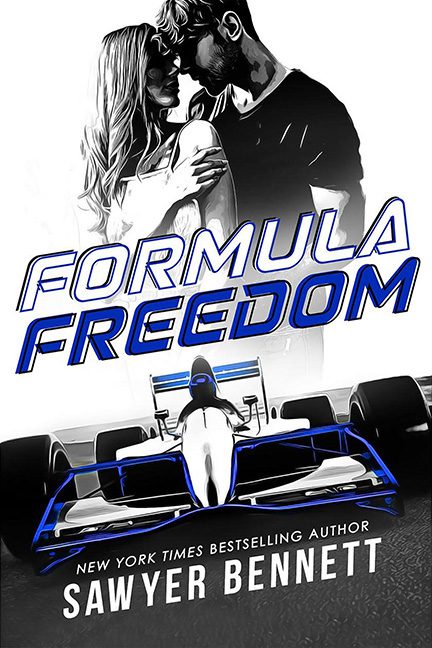
Start your engines, because this cover is about to crash and burn harder than a rookie driver taking the first corner at Monaco. Formula Freedom should be a high-octane, adrenaline-soaked ride filled with love and danger. Instead, it looks like someone mashed together a romance stock photo with a 1999 bowling alley arcade cabinet.
Let’s talk composition. At the top, we’ve got a grayscale couple locked in an almost-romantic, almost-chiropractic embrace. It’s soft and moody, like the opening credits of a CW drama. And then, WHAM, right underneath them: a Formula 1 car that looks like it escaped from a Forza Motorsport menu screen. The outlines glow with random neon blue strokes as if Tron got lost on its way to the grid. Romance cover? Racing thriller? Nope — this is “Photoshop roulette,” and everyone loses.
And then there’s the title font. Formula Freedom is tilted and stretched, screaming “look at me, I’m fast!” Unfortunately, it’s less Ferrari at full speed and more Microsoft WordArt from the days when everyone thought gradients were futuristic. If you squint, it could easily pass for the signage on a “Daytona Racer” arcade machine where half the steering wheels don’t work.
The whole vibe is painfully mismatched. Stylized grayscale lovers, traced neon race car, clunky PowerPoint font — none of it fits together, and none of it tells us what kind of book this actually is. Is it love on the racetrack? A NASCAR fever dream? Or just a Photoshop experiment that escaped containment?
Verdict: This is a horrible cover. Not fast, not furious, not even fun. Just a pit stop on the long track of bad design. Someone wave the checkered flag already, because Formula Freedom never made it out of the garage.
