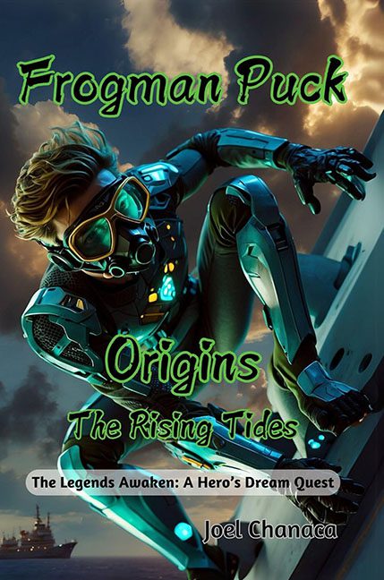
Somewhere in the deep sea of cover design mishaps swims a lone amphibious vigilante—his name is Frogman Puck, and his mission is apparently to leap off skyscrapers in a scuba suit and punch typography in the face.
Let’s begin where all design disasters should: the title. “Frogman Puck: Origins – The Rising Tides (The Legends Awaken: A Hero’s Dream Quest)” is less of a title and more of a fever dream transcription from someone who fell asleep binge-watching Marvel trailers. It’s not a subtitle—it’s a declaration of war against brevity. No one needed four levels of branding unless you’re launching a multi-platform franchise, in which case… maybe start with legible font?
Speaking of fonts—oh, the fonts. The title is presented in what appears to be radioactive Comic Sans dipped in Mountain Dew and regret. It glows, it wiggles, and it clashes with everything around it like a fluorescent toddler crashing a black-tie gala. The author’s name, tossed off in the corner like it missed the rehearsal, is in a completely different font that suggests even it didn’t want to be involved.
Then there’s the art. Or, more accurately, the sci-fi scuba man doing parkour on what might be a spaceship, a cruise ship, or a rejected set from Titanfall. Is he underwater? In space? In a wind tunnel at a laser tag arena? We may never know. The rendering is slick in that vaguely AI-polished way, but it’s also deeply awkward. His pose says “ready for action,” but his lighting says “about to be abducted by a green screen.”
And don’t overlook the scenery—clouds boiling like an alien invasion is moments away, lens flares working overtime, and a horizon that screams “desktop wallpaper from 2007.” There’s enough unintentional drama here to power a CW pilot.
Now let’s talk about the subtitle’s little gray pill-shaped bubble: “The Legends Awaken: A Hero’s Dream Quest.” This, friends, is the final boss of bad subtitle formatting. It’s like someone found a PowerPoint shape tool and thought, “Yes. This is prestige design.”
The tragedy here is that someone clearly had a vision—a glowing, amphibious, heroic vision—and then attempted to cram every single trope and visual effect into one unlucky JPEG. The result is like watching a superhero trip over their own origin story in real time.
Final verdict: This isn’t rising tides, it’s sinking standards.
If you stare long enough at Frogman Puck, the only thing that awakens… is your graphic designer’s migraine.
