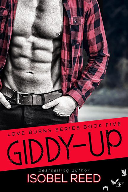
Ah, the “headless abs” romance cover. A proud tradition in publishing where men are reduced not to characters, not to personalities, but to a gleaming six-pack wrapped in plaid. Giddy-Up rides this overworked trope straight into graphic design purgatory, and boy, does it fall off the horse.
First, our cover cowboy — or rather, our cover torso. No hat, no lasso, no horse, no hint of anything remotely “Western.” Just abs, belt buckle, and a lumberjack shirt left hanging open like it lost the will to button itself. This isn’t a cowboy — this is a generic fitness model who wandered out of a Men’s Health photoshoot and into a rodeo-themed fever dream.
Then there’s the title. “GIDDY-UP” in distressed red font, screaming at us diagonally across a banner like the world’s angriest name tag. If fonts could neigh, this one would sound like a horse choking on sandpaper. Combine that with the harsh black/white/red palette, and instead of smoldering romance we’re left with the energy of a nightclub flyer for “Country Line Dancing Night — Ladies Drink Free!”
It’s supposed to be passion, but it ends up parody. A book cover so generic you could slap any title on it (Cowboy Lust, Plaid Desire, Abs at Sundown) and nobody would know the difference.
Verdict: Giddy-Up isn’t just a horrible cover, it’s the equestrian equivalent of reheated leftovers. Bland, overdone, and utterly unworthy of the saddle it rode in on.
