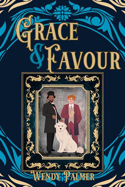
There’s decorative. And then there’s Grace & Favour, a cover that took one look at restraint and said, “Absolutely not, bring me more filigree.” What we have here is less book design and more gilded vector bedlam, like someone tried to turn a wedding invitation into a Regency-themed video game loading screen.
Let’s begin with the structure — or rather, the infinite nesting doll of frames. There’s a book cover. Inside that, a frame. Inside that, another frame. Inside that, two characters and a cloud-dusted background struggling to breathe under layers of ornate gold barf. It’s like staring into a design vortex where each layer begs for dominance but none are allowed to win.
The characters? They look like they wandered in from a children’s educational pamphlet on Victorian etiquette. Flat, emotionless, and vectorized within an inch of their lives, they’ve been pasted onto a dull, washed-out background like clip art trying to cosplay as fine art. One holds a leash, the other a rose, and between them is a stoic white dog who might be the only character emotionally invested in this entire ordeal.
Now let’s talk gold.
There’s gold lettering. Gold flourishes. Gold vines. Gold corners. Gold outlines. Gold faux-embossed title treatment. It’s gold on gold on gold, with just enough blue thrown in to keep it from triggering metal fatigue in your optic nerves. The effect is less “elegant luxury” and more “graphic design student discovers gold gradients and refuses to stop.”
The typography tries to echo classic charm, but what we get is a title where “Grace” and “Favour” are practically dancing in different fonts and “&” decided it was time to stage a coup. The author’s name at the bottom is sandwiched between yet more flourishes like it’s being held hostage by a baroque border cartel.
And the composition? Imagine you spilled a box of fancy digital scrapbook elements on your desk, got overwhelmed, and just decided to use all of them at once. That’s the energy here. Nothing has room to breathe. Every inch is stuffed with visual noise — as if the design was afraid the reader might look away for even a second.
Is it the worst cover ever? No. But it’s like someone had the kernel of a charming idea and then violently overdecorated it into submission. A design gamble so overdressed it forgot to check if the party had a theme.
In short: Grace & Favour gave us frame-in-a-frame confusion, clip-art cosplay, and enough gold to bankroll a small empire — but forgot to give us one clear, cohesive cover.
