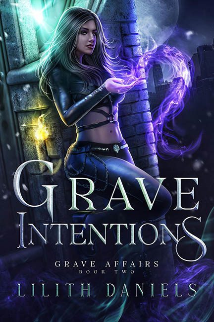
From a distance, Grave Intentions looks like it’s ready to strut onto the shelves of your local paranormal fantasy section and whisper darkly seductive promises of necromancy and eyeliner. But zoom in, and this thing falls apart faster than a summoned skeleton in high wind. Welcome to a Photoshop graveyard — and this cover brought the shovel.
Let’s start with the centerpiece: our leather-clad heroine who looks like she just rage-quit a Hot Topic modeling gig. She’s leaning against a castle wall like it’s prom photo night, cradling a glowing swirl of magic that’s part spell effect, part toxic vapor. Her expression is sultry; her setting is visually incoherent.
Because what even is this setting? On the left, we’ve got a stone tower — possibly medieval. Behind her? A glowing, semi-transparent urban skyline, because the fantasy is apparently bi-coastal. The moon floats ominously over it all like a confused observer. “Am I in the past? The future? Should I be glowing purple?” Yes, Moon. Yes, you should. Because everything is glowing.
Purple mist? Glowing. Streetlamp? Glowing. Magic particles? Glowing. Your retinas after staring at this for more than 10 seconds? Also glowing.
But the real MVP of this trainwreck? The Chains. Yes, the decorative chains dangling from her waist that defy all earthly physics. They’re not hanging — they’re hovering like they’re enchanted with low-grade anti-gravity. At this point, they’re not even accessories — they’re props in a bad CGI scene from a fan film called Fifty Shades of Sorcery.
Now, let’s talk lighting. Specifically: the two dueling light sources on the wall behind her. There’s a purple flame swirl on one side and a golden sconce glow on the other, and both are casting shadows like they forgot to coordinate with the rest of the scene. Her body? Lit from a third, unrelated source — possibly the off-camera flash from a cosplay shoot in someone’s garage.
And don’t think we didn’t notice the Photoshop filter festival. Magic swirls. Light flares. Particle effects. Glowing mist. The left side of the image looks like someone knocked over a glitter cauldron. The result? It’s less “dark magic” and more “Lisa Frank summons a banshee.”
Typography? Serviceable. At least it matches the vibe, even if it’s trying a little too hard to scream “GOTHIC MYSTERIOUS SEXY.” Bonus points for not putting a skull in the “O” of “Intentions,” though we wouldn’t have been surprised.
And look — we get what it’s trying to do. This is a genre known for edgy vibes, swirling mists, and midriff armor. But genre is not an excuse for digital chaos. This isn’t edgy — it’s a digital slip ’n slide of fantasy clichés, stock art layering fails, and visual effects that forgot their cue.
Grave Intentions has all the right parts: mysterious woman, magic, moonlight. But they’re assembled like a fantasy-themed ransom note. It’s a cover that casts a spell — and it’s “Confuse Viewerus Maxima.”
