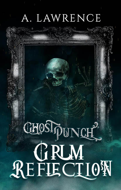
Some sequels improve on the original. Others… just return with more fog, more fonts, and a skeleton who looks like he took a wrong turn on the way to Pirates of the Caribbean. Welcome to Grim Reflection, the latest entry in the Ghost Punch series — a title that promises introspective horror but delivers Photoshop Purgatory with a teal color cast.
Let’s begin with the central figure — a lonely, underpaid stock photo skeleton trapped inside an ornate picture frame, forever posing like he’s waiting for the photographer to say “Boo.” He’s not scary, spectral, or particularly reflective. He’s just kind of… there. Floating in dark teal mist, awkwardly angled, and slightly transparent, as if even he doesn’t want to be fully committed to this visual disaster.
Now, that frame. Yes, the same antique frame from That’s the Spirit is back — and it’s still clashing with everything around it. It hovers in space like it’s haunted by the memory of better graphic design. The lighting doesn’t match the fog. The fog doesn’t match the background. The background doesn’t match any artistic direction. We’re looking at a low-effort, high-contrast supernatural salad with zero dressing and too many leftover stock photos.
But the real nightmare here is the typography. Oh yes, the fonts — a hallmark of the Ghost Punch design ethos, which seems to be “why choose one when you can maim five?” The title Grim Reflection is styled in what can only be described as “possessed typewriter meets Renaissance carnival.” Letters are skewed, stretched, and swirled with inconsistent curls, giving the impression that each one was styled by a different ghost with a personal vendetta against readability. “GHOST PUNCH,” the series branding, appears again in its cracked, gothic font, looking like it just barely survived the design process.
And let’s not forget the fog. Always the fog. Teal, once again, choking the bottom of the cover like ghostly vape smoke from beyond the grave. It’s not moody. It’s not spooky. It’s just there, clouding any attempt at clarity or contrast like a designer’s “oops” that got stuck on a separate layer.
So what exactly is the grim reflection? Is it the skeleton reflecting on his design career? The reader reflecting on their life choices? The designer reflecting on why none of these elements work together? Probably all of the above.
In conclusion, Grim Reflection reflects one thing very clearly: a commitment to unpolished chaos. It’s a masterclass in how not to create a horror series aesthetic, repeating the sins of its predecessor with bold, undead enthusiasm. The ghost may punch, but the design flails.
