Some secrets are worth discovering.
Others — like His Secret Illuminations — should’ve stayed buried under a pile of medieval wigs and half-baked Photoshop filters.
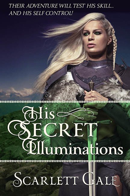
Let’s begin with the image that graces this fever dream: a warrior woman, standing proudly in faux armor, wielding a sword that may or may not be a repurposed lawn ornament. Her expression? Vacant. Her gaze? Confused. Her outfit? Clearly sourced from the Spirit Halloween “Viking Temptress” aisle.
Her blonde braid hangs like it was hot-glued five minutes before the photo shoot, and her fur mantle appears to have been stolen from a decorative throw pillow. Meanwhile, her sword-hand pose has all the tension of someone politely waiting in line at a fantasy-themed Starbucks.
But what truly catapults this cover into the Book Design Hall of Shame is the crime scene that is the typography. The title, His Secret Illuminations, is decked out in a calligraphic font so curly it looks like it was forged in a wedding invitation generator. Swirls! Swashes! Arbitrary capitalization! It’s the kind of font that says, “I cast Confusion at 3rd level on your eyeballs.”
Let’s also talk about that green glow effect behind the title, which is doing its best to say “magical mystery,” but ends up looking like someone sneezed a transparency gradient all over the bottom half of the image. The decorative line across the center? Is it lace? Is it a chain? Is it the visual representation of this cover’s structural integrity unraveling in real time? Who’s to say.
And then, dear reader, we reach the pièce de cringe:
“THEIR ADVENTURE WILL TEST HIS SKILL… AND HIS SELF CONTROL!”
Ah yes, the classic sword-and-seduction pitch. The high fantasy equivalent of “She’s beauty, she’s grace… she might stab you in the face.”
Between the top tagline, the glowing midsection, and the author name in its own font entirely — this layout has the consistency of a first-time D&D player trying to roleplay a love interest with a charisma score of 4.
To recap:
-
Warrior princess? Check
-
Sword that looks like it came with a toy knight set? Check
-
Font choices that fought each other and lost? Check
-
Vague sensual tagline written by someone who once skimmed a Highlander novel? Check
This isn’t His Secret Illuminations — this is Her Graphic Design Miscalculations.
Final score: 2 fonts too many, 1 misplaced wind machine, and zero self-control from the person who made this.
