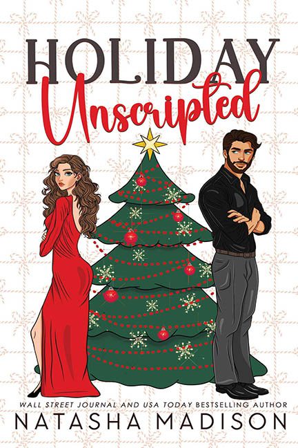
This cover almost slid by under the peppermint-scented radar, wrapped in a cozy romcom aesthetic and just enough red-and-green to lull us into submission. But not today, Holiday Unscripted. Not. Today.
Let’s start with the title, which is doing its best to look like a boutique logo from a failing Etsy shop. “Holiday” in bold, no-nonsense caps — because the season is serious — and then “Unscripted” in that familiar faux-handwritten font that has never once been spontaneous. It’s the typographic equivalent of a manufactured meet-cute. The font pairing screams “we tried something different” but ended up with a kindergarten flyer for a winter pageant.
Now, brace yourself for the art. You’ve got your classic romcom duo: one red-dressed woman with enough hip-popping attitude to power a Hallmark marathon, and a bearded, arms-crossed man who apparently just came from the “confused lumberjack in the city” convention. These two are supposed to have sizzling chemistry. Instead, they look like they’re posing for separate dating apps that hired the same cartoonist.
Between them? A Christmas tree that is doing everything in its two-dimensional power to stay relevant. It’s got garland, ornaments, and a weird flatness that makes it look like a cardboard prop someone jammed into the scene after the real tree canceled. It’s not just flat—it’s aggressively flat. Like it’s been ironed. And the cherry on top? A clipart star that looks like it came from a second-tier PowerPoint template.
Then we zoom out. The background is supposed to resemble festive wrapping paper, but it’s giving “Dollar Tree tablecloth in need of ironing.” It adds nothing but noise and makes the whole thing look like a middle school flyer for a winter dance that got snowed out.
And let’s not ignore the worst offender: the total absence of depth. These characters don’t exist in a space. They exist in a void. There’s no shadow, no grounding, no sense that any of these design elements have ever been in the same zip code. They are, in fact, prisoners in a static design nightmare — sentenced to eternity on the front of a book cover that feels like it was assembled entirely from last-minute Canva scraps.
In conclusion: this cover isn’t just unscripted — it’s unfocused, unpolished, and unforgivable. It’s trying to be cozy, but instead, it’s wrapped in a thin layer of lazy and tied with a ribbon of graphic design indifference. A holiday romance? Maybe. But this design? A stocking full of coal and some clipart tears.
