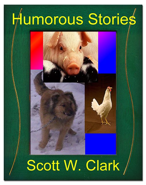
Welcome to the barnyard of bafflement, where color theory, photo editing, and basic design principles come to die. Let’s talk about Humorous Stories by Scott W. Clark — a book cover so devoid of intentional design it feels like a rogue printer just got creative during a power surge.
At first glance, you might think this is a parody of a parody. But no. This is the actual, earnest cover someone designed — possibly during a Windows 98 crash — and said, “Yes, this captures my literary voice.”
Let’s begin with the obvious: the three-photo collage of livestock. A piglet, a chained backyard dog, and a glamour-shot chicken walk into a Photoshop document. There’s no punchline because the punchline is the layout. Each image looks like it was pulled from different decades, file formats, and levels of resolution. The pig, suspiciously adorable, screams “stock photo.” The chicken has studio lighting. And the dog? Well, that poor guy looks like he’s waiting for someone to finish shoveling the driveway.
Now let’s address the color-block background. Bold neon rectangles of magenta, red, blue, and lavender frame the animals with the subtlety of a rave flyer. And none of them match or harmonize. If you told me this was designed using MS Paint with a mouse from 2002, I’d believe you. Blindfolded.
And then there’s the “frame” — a fake green woodgrain border featuring two squiggly gold lines like someone tried to mimic a rustic picture frame with the graphic sensibilities of a gas station flyer.
The typography? Pure chaos. The title and author’s name are in a loud, bright yellow sans-serif font that looks like it was chosen at random after someone typed “funny” into Microsoft Word and clicked the first thing they saw. “Humorous Stories” might be the title, but the font is doing more work to get a laugh than anything else on the page.
What ties it all together is how completely clueless the composition is. There’s no hierarchy. No focal point. No balance. Just three random animals trapped inside a Windows XP fever dream, bordered by dollar store craft paper, and screaming “humor” in a font last used on a PTA bake sale sign.
It’s the kind of cover that whispers, “I designed this while waiting in line at the DMV.” The kind of cover that dares you to ask, “Is this satire?” and then never answers.
So here we are. A book claiming to be humorous, whose cover alone delivers on that promise — but not in the way the author intended.
This is not a case of “so bad it’s good.” This is a case of “so bad it needs a design intervention, three fonts removed, and a chicken with union representation.”
Thanks for the laughs, Humorous Stories. You didn’t mean to be the joke — but you absolutely are.
