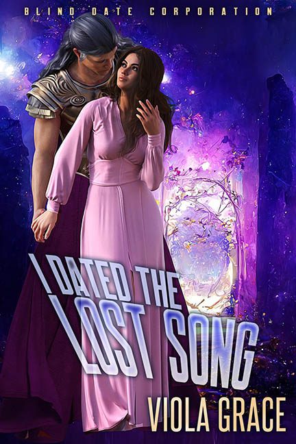
Somewhere between a cosmic karaoke bar and a fanfiction fever dream, this cover dared to ask the question no one needed answered: “What if a fantasy romance novel was also a rejected poster for a Eurovision sci-fi musical?”
Welcome to I Dated the Lost Song, where every design choice is as confusing as the title. Let’s start with that—what is the lost song? Is it a person? An actual tune? A metaphor? A badly named elven Tinder profile? The title is trying to be whimsical or profound, but lands somewhere between baffling and totally incoherent. And don’t even get us started on “Blind Date Corporation” stamped across the top like a dystopian dating service that definitely voids its HR policies.
Now let’s talk about the couple front and center, whose chemistry is as unnatural as the AI rendering that created them. The male lead appears to be whispering sweet nothings—or maybe a software update—into her ear. Her body language says “soft fantasy heroine,” while his stance and outfit scream “space prince who time-traveled here from a steampunk bodybuilding convention.” Also: his right arm disappears behind her shoulder like a rendering glitch that couldn’t handle physical affection.
The woman’s pink dress floats like a stiff bedsheet in a zero-gravity costume department. And her hand? It’s poised in the classic “Do I smell toast?” gesture. We have no idea what this scene is trying to convey emotionally, but it might be romantic indigestion.
Behind them is a swirling mess of glowing purple galaxies and a floral neon portal that looks like a Lisa Frank fever dream. The background is over-processed, over-saturated, and yet somehow completely disconnected from the people slapped on top of it. It’s like someone yelled “MAGIC!” and the AI just dumped every purple asset it had in stock.
And that title treatment? A typographic crime scene. The forced perspective angle is trying to add depth, but it just makes “LOST SONG” look like it’s about to slide off the page into a wormhole. It’s chunky, clunky, and entirely at odds with the genre it’s trying to represent. If the book is romantic fantasy, then why is the typeface giving off “military space opera sequel” vibes?
To its credit, this cover tries—there’s energy, there’s drama, there’s a clear effort to be bold. But the result is like a mixtape of overused genre tropes, design shortcuts, and rendering fails. It’s less Lost Song and more Lost Opportunity.
Now if someone can find the actual song, please tell it to come back and take responsibility.
Would you like to nominate this one for a Flying Monkey Award? Because it’s absolutely circling the runway.
