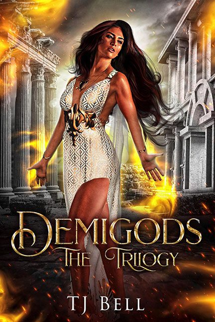
The cover tries for divine spectacle and ends up feeling like Mount Olympus collapsed under the weight of its own Photoshop layers. The ambition is loud and the execution is louder, and every element seems to be fighting for its own reality. The architecture alone looks like it was assembled by a committee of confused deities. A Doric ruin sits shoulder to shoulder with a pristine Corinthian structure, as if centuries of architectural evolution decided to merge into a single, inexplicable backdrop. They do not share lighting, scale, or logic. They simply coexist because the designer apparently said yes to every available temple asset.
The central model is the real epic here. She carries every hallmark of AI image construction without the benefit of a quality pass. Her bracelets appear embedded in her skin like decorative implants. Her necklace defies gravity by flipping against her collarbone. Her legs are stitched in with no clear attachment point, glued over the dress in a way that turns fabric into a suggestion rather than an object. The body proportions wobble from torso to hip, and the backside protrudes in defiance of anatomy, lighting, and probably ethics. Nothing about her stance connects her to the environment around her, which gives the impression that she is floating slightly above the ruins like a sticker that was never fully pressed onto the page.
The special effects push this cover over the cliff. Every edge glows. Every surface burns. Every corner of the scene is smeared with a filter that refuses to take no for an answer. Sprites streak across the air while golden particles swirl around her hands, created with the exact same brushing technique that powers many amateur fantasy covers. Even the air behind her ripples with an unexplained silk scarf or vapor trail that has no source, no anchor, and no narrative purpose. It flaps behind her like a leftover remnant from a discarded layer that refused to be deleted.
The typography attempts to elevate the chaos with gold foiling and stately curves, although it feels more like a label for an over-the-top theme park ride than the title of an epic trilogy. The glow around the letters further disconnects them from the background, which only enhances the feeling that each part of the design lives in its own universe.
This cover is a showcase of excess. Effects pile on top of effects. Assets sit on top of one another without blending. The composition cocoons itself in noise. It wants to be radiant and mythic, yet the visual confusion buries any sense of grandeur under layers of filters and anatomical guessing. It is a lesson in how quickly bold ideas can slide into a swirl of glowing shortcuts, ungrounded elements, and misplaced ambition.
Divinity may be eternal, but good design needs a grounding spell. This cover missed that ritual entirely.
