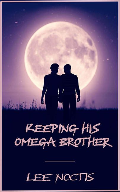
Ah yes, “Keeping His Omega Brother” — a title that dares you to say it out loud in public and then dares your eyes to survive the visual fallout. This cover isn’t just a misstep; it’s a full interpretive dance of design failure set against the largest moon humanity has ever seen. NASA called. They want their CGI back.
Let’s start with the background — or rather, the single stock photo that was dragged, dropped, and forgotten. Behold: two generic silhouetted figures holding hands under a moon so ludicrously oversized it looks like it’s about to crush them and end this awkward romance before it begins. The couple, presumably the titular Alpha and Omega duo, are featureless to the point of existential crisis. They could be anyone. Lovers. Brothers. Co-workers in a cursed HR training video. The image offers no clues, just endless purple haze and a field that looks like it might smell vaguely of lavender and regret.
Now, the typography. If you’ve ever wondered what happens when a broken heart designs a font using only eyeliner and angst, this is it. The title is scrawled in a jagged, distressed script that seems less “graphic design” and more “emotionally-charged graffiti behind a Hot Topic.” It’s all caps, because subtlety packed up and left after reading the title. The spacing is awkward, the alignment is a mystery, and there’s a random thin line floating in the middle like a lost punctuation mark searching for meaning.
The pale pink text color is clearly meant to pop against the dark background — and instead, it whimpers. Combined with the heavy emotional tone the font is desperately trying to convey, it gives the whole thing the aesthetic of a Twilight spin-off promo designed in MS Paint by someone going through a very specific breakup.
Let’s not forget the border — a faint, sickly pink rectangle that does absolutely nothing except fence in the awkwardness. It’s not framing the image; it’s trapping it, like a warning label: Caution: Design Choices Inside May Cause Whiplash.
The most baffling part? This cover thinks it’s working. It genuinely believes it’s giving you epic romance, forbidden yearning, and dramatic moonlit passion. But all it’s really giving you is a textbook example of what happens when genre tropes, stock images, and bad fonts have an unholy love triangle of their own.
“Keeping His Omega Brother” might keep him, but good design? That ran off into the night and didn’t leave a note.
