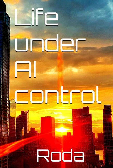
If this cover is what life under AI control looks like, please unplug the machines immediately. “Life Under AI Control” by Roda doesn’t just look like it was designed by artificial intelligence—it looks like it was done by a toaster running a trial version of Microsoft Paint circa 2002.
Let’s start with the title font, which boldly screams “I discovered fonts today!” in a blocky sci-fi typeface that’s about as futuristic as a DVD player. It’s stacked awkwardly down the left side of the cover like someone forgot to unlock the text box proportions and just rolled with it. The spacing is uneven, the alignment defies both gravity and logic, and “Roda” floats at the bottom like a lost Lego piece after a tornado. Why is the author’s name just… chilling down there, like it wasn’t invited to the party?
And then we have the background: a sunset cityscape that appears to be part post-apocalypse, part iPhone wallpaper, and all low-effort. It’s saturated to the point of blinding, with colors so violently enhanced you can practically hear the JPEG compression scream for mercy. Nothing about it says AI or control—unless the AI in question has taken over a stock image site and gone rogue with the saturation slider.
But let’s talk about the pièce de résistance: that red laser beam. Oh yes, the mysterious red streak cutting through the skyline like someone opened Photoshop, found the brush tool, and said, “You know what this needs? Sci-fi.” It’s not emitting from anything. It’s not aimed at anything. It just exists—floating like the ghost of design choices past. One appears to be slicing through buildings. Another hovers, possibly trying to spell SOS in Morse code.
Even the city buildings themselves feel like they were hastily slapped on as an afterthought. The entire composition is off-balance, unharmonious, and, frankly, looks like it was made while someone was trapped in an elevator with a deadline and no internet.
This isn’t dystopian sci-fi—this is a dystopian design. A cover should invite the reader into the world of the story. Instead, this one makes you want to run for the hills—or at least the nearest design school open house.
“Life Under AI Control” deserves a hard reboot, starting with the title font, then the composition, then literally everything else. It’s not just a cover fail—it’s a cautionary tale.
