Some book covers whisper “indie.” Some scream “artistic freedom.” And then there’s Losers, which proudly kicks down the door, waving a half-dried marker and yelling, “Look, Ma, I used all the colors!”
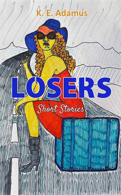
The first thing that hits you—besides the blinding yellow of the protagonist’s skin—is confusion. What are we looking at? A woman on the side of the road? A Picasso reinterpretation of human anatomy? A protest against the invention of perspective? Yes. All of the above. The poor soul on this cover sits in the middle of a scribbled landscape that looks like a coloring book escaped an asylum. Her body seems to exist in two dimensions, her head floats slightly too small for her torso, and her left arm appears to have given up halfway through existing.
Her fashion choices are equally chaotic. A red dress, a purple hat, yellow skin, blue luggage, and orange sunglasses—it’s like the Crayola 64-pack exploded and she just rolled with it. The hat sits atop her head as though pasted on in post, and those sunglasses are less “mysterious traveler” and more “I cut these out of construction paper.”
Let’s discuss that suitcase—an aggressively blue brick that’s more Minecraft block than luggage. It’s perched by her leg like it’s waiting for a bus that’s never coming. The shading gives it all the realism of a third-grade art project, and the outline wobbles like the artist sneezed mid-stroke. It’s an object of intrigue, mostly because you’re left wondering: how did something so rectangular end up so emotionally confusing?
The road itself adds to the surrealism. It bends, not in a natural, cinematic way, but in a “topography drawn by a confused GPS” kind of way. It meanders through what looks like rolling hills, or maybe just aggressively scribbled gray blobs, before vanishing into a storm cloud of uncertainty. The white lane dividers lean at different angles, clearly exhausted by the effort of maintaining linearity in this universe.
Now, the typography. “LOSERS” is slapped across the center in bold blue letters like it’s auditioning for a self-help parody. It lands squarely on top of the drawing, squashing the poor woman’s arm and dominating the entire frame. It’s a design decision so abrupt it feels like someone dropped it in by accident and said, “Yeah, that’s good enough.” Below it, “Short Stories” perches awkwardly, tilting just slightly—as though even the text is ashamed to be here.
The author’s name, “K. E. Adamus,” floats above the chaos in a bright mustard yellow, set against a cloudy sky that looks like it was drawn in during a lunch break. It’s barely legible, like the designer knew you might not want to read it twice.
Color harmony? Nonexistent. Composition? Missing in action. Shading? Optional, apparently. Everything about Losers screams “hand-drawn with determination, scanned with hope, and lettered with regret.” It’s a visual representation of someone who once saw a book cover, thought, “How hard could that be?” and immediately found out.
The irony of the title doesn’t escape us, either. It’s almost poetic—Losers looks like the result of a creative battle lost decisively to every tool in the art kit. It’s the kind of cover that makes you stare not because it’s good, but because your brain refuses to believe it exists.
And yet… there’s something endearingly earnest about it. Beneath the wobbly lines and color chaos, you can feel the effort—the pure, unfiltered determination to make something that means something. Unfortunately, what it means is “I’m sorry, but no.”
In the grand hall of bad design, Losers earns its title with gusto. It’s the kind of cover that dares you to judge it, then shrugs and says, “Yeah, you’re probably right.”
