
Our rework

Category: Erotica / Paranormal
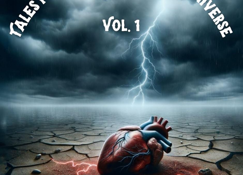
Current State: Seriously flawed; requires rework
This cover reaches for metaphor but lands squarely in confusion, sending more mixed signals than a haunted dating profile.
Art Direction & Imagery:
The focal image of a human heart—sudo realistic and oddly pristine (due to the blue colouring)—planted in cracked earth under a lightning storm is a jarring metaphor that fails to connect with the genre. Instead of evoking passion, paranormal intrigue, or erotic tension, it leans heavily into surreal melodrama with no clarity on genre expectations. Is this a dark fantasy? A horror drama? A weather-themed anatomy textbook?
The visual does not remotely align with the story content, which includes emotionally charged erotica and paranormal romance. There’s a disconnect between the gritty romantic themes and this strange, standalone symbol that doesn’t communicate character, setting, or stakes.
Typography:
The font selection and arrangement come across as amateurish. While the arched placement of the subtitle aims for drama, it instead clutters the composition and emphasizes the wrong elements. The typeface used throughout is cartoonish and at odds with the intended mood—erotica and paranormal demand elegance, allure, or mystery, not a bouncy children’s-font aesthetic.
The author’s name in all caps and a novelty-style typeface (especially the pseudonym “Saddletramp1956”) lacks polish. It needs to command authority and intrigue, not echo a Reddit handle.
Composition & Layout:
There’s no hierarchy or flow in the layout. The visual weight of the curved title, curved subtitle, and lower-heavy graphics all compete without resolution. The storm and lightning effects could have been powerful if supporting a stronger focal point, such as human silhouettes or dramatic scenes from the stories.
Genre Signaling:
Crucially, the cover gives no indication this is erotica or paranormal. The themes of lust, betrayal, rekindled love, and supernatural allure are entirely absent. Readers would have no clue about mature themes or sensual intrigue from this visual, and it risks being overlooked by its intended audience—or worse, mis-categorised.
Conclusion:
This cover is emblematic of a well-meaning but misguided design attempt. While there may be a concept buried beneath the dust and thunder, it’s ultimately too abstract and genre-misaligned to serve as a functional, marketable cover. A complete redesign is advised—one that embraces visual storytelling through evocative character work, mood-appropriate color grading, and typefaces that seduce rather than shout.
Our Redo and Why It Works
1. Atmosphere & Tone:
The stormy sky, lightning, and windswept grasses pair beautifully with the romantic embrace. It perfectly conveys the blend of emotional intensity and paranormal drama the collection promises.
2. Focal Composition:
Placing the couple in the right-center fits your 16:9 print requirement and ensures that a spine and back cover can be easily built out on the left.
3. Font Selections:
-
Title (“Love, Lost and Found”) in Cinzel Decorative brings elegance and mystique.
-
Sub-title is now more legible and integrated, enhancing genre signals.
-
Author Name in Oswald-style white offers clear attribution while staying understated.