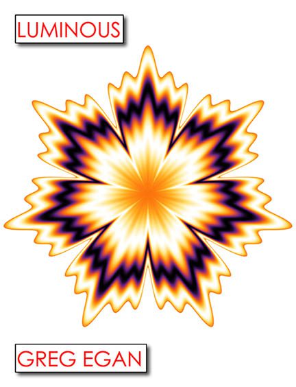
This cover may be titled Luminous, but visually, it’s about as radiant as a broken LED bulb in a dentist’s waiting room. If ever a book cover begged to be mistaken for an outdated screensaver or a freshman year computer graphics project, this is it.
Front and center, we have what appears to be a weaponized snowflake. It’s jagged, it’s symmetrical, and it’s glowing like it just got dared to touch a Tesla coil. This radial burst of gradient chaos looks less like “high-concept science fiction” and more like a radioactive maple leaf that was rejected from a rave poster for being too intense. You can practically hear it buzzing.
Now let’s talk typography—or the lack of effort therein. The title “LUMINOUS” and the author’s name “GREG EGAN” are boxed in like they’ve been grounded. They’re confined to red-outlined rectangles, shoved into opposite corners of the cover like they’re in timeout. The spacing is weird, the alignment feels like a cut-and-paste accident, and the overall effect screams “intern-made this in Publisher.” You could recreate this layout in PowerPoint in under 45 seconds, and it would still look like it needed more work.
And the font choice? Generic sans-serif, all-caps, no personality. Bold enough to shout at you but not bold enough to say anything interesting. There’s no design hierarchy, no emphasis—just two labels hovering in a blizzard of white space like they wandered in from a completely different book.
Oh, and the background? A void. A vast, empty canvas of white nothingness that makes the cover feel like a sticker slapped onto a blank sheet of printer paper. It’s not clean. It’s not minimalist. It’s lazy.
It’s hard to tell what genre this is trying to represent. Is it hard sci-fi? A pop math textbook? An avant-garde manual on how not to design things? The cover gives us no clues. It’s visually uninviting, emotionally sterile, and totally unfit for a book with a title as promising as Luminous. This cover doesn’t glow—it glares.
If the goal was to make a design so neutral it becomes unsettling, then congratulations, this is a masterpiece of malaise. But if the goal was to attract readers with compelling visuals, we’ve got ourselves a certified digital flop.
This isn’t Luminous. This is Dulluminated.
