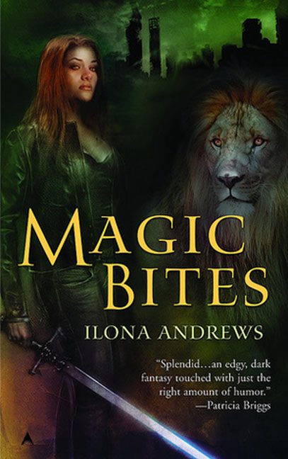
Urban fantasy covers are notorious for their leather-clad protagonists, glowing weaponry, and large, mysterious animals that loom without explanation. But Magic Bites takes this formula, drags it through a fog machine, forgets to attach anyone’s feet, and then politely asks us not to look too closely. Well… we looked.
At first glance, it appears solid: a strong female lead, a brooding lion, a glowing sword, and a decaying skyline — check, check, check, check. But then the Photoshop seams begin to show, and suddenly this cover isn’t magic. It’s magically disjointed.
Let’s start with the anatomy of the heroine, who seems to be cobbled together like she was assembled from the spare parts of three different stock photos. Her waist-up appearance is painterly and composed — strong jaw, serious expression, wind-tousled hair. But waist-down? We descend into body horror via opacity slider. Her legs fade into shadow like the lower half of her body is emotionally unavailable. There’s no detail, no defined stance, and no feet — just a misty disappearance into an artist’s unresolved layer.
And then there’s the sword, a glowing beacon of confusion. Rather than being held, gripped, or even vaguely touched, it simply hovers behind her hand like a shy intern afraid to interrupt. It’s glowing blue, which in theory should cast some light on her clothes or hand — but nope. The glow has no purpose. No reflections. No logic. Just… there, glowing out of obligation.
Enter the lion, who may or may not be here willingly. He’s partially blended into the background like someone got tired halfway through a “Ghost Lion” Pinterest board and dropped the opacity to 60%. Is he magical? Is he judgmental? Is he photoshopped into a cover where he doesn’t belong? Yes. He stares with majestic apathy, floating beside our heroine like an afterthought from a wildlife calendar.
The lighting across the entire composition is a war crime. Every object is lit from a different direction:
-
Her face? Lit softly from the side.
-
Her jacket? Lit from below.
-
The sword? Self-illuminated but passive-aggressive about it.
-
The lion? Lit from within by mystical lion shame.
No two elements agree on a source of light, and no one invited the shadows. The result is a cover where everything looks like it was rendered separately — because it was.
But let’s not forget the background, where the skyline of crumbling buildings tries to set a dystopian tone, but mostly looks like the default desktop wallpaper for a fantasy-themed escape room. It doesn’t interact with the characters in any meaningful way. It just exists — dark, green, slightly textured, like spinach dip for the supernatural.
The typography, thankfully, is the one area that behaves. The gold serif font is readable and genre-appropriate. But by that point, we’re already neck-deep in visual dissonance. A legless heroine, a non-committal sword, and a half-ghost lion have already made their presence known.
In the end, Magic Bites isn’t a cover. It’s a collage with ambitions — a digital chimera of moody elements that refuse to occupy the same physical plane. It’s not bold enough to be camp, not bad enough to be endearing, but just disconnected enough to earn its place in the Subtle Photoshop Tragedy Hall of Fame.
Because magic might bite —
but this cover just kinda floats.
