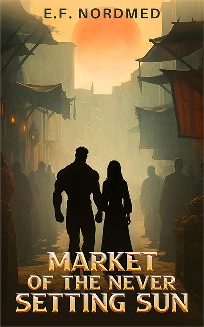
Welcome to the Market of the Never Setting Sun, where the bargains are hot, the sun never clocks out, and the design choices are about as coherent as a medieval flea market after last call.
Front and center we’ve got our heroic duo, except they don’t so much stand in the market as they do hover awkwardly in front of it like someone pasted their silhouettes in during lunch break. Our leading man is built like a Lego minifig on steroids—all bulk, no nuance—while the woman next to him has all the depth of a cardboard cutout from a discount costume shop. If these two are supposed to anchor the story, they look more like action figure promos than fantasy protagonists.
Then there’s the marketplace itself, which should feel alive and bustling. Instead, it looks like a glitchy RPG town where half the NPCs didn’t load their textures. Blurry background figures shuffle around like placeholder ghosts, while the lighting makes no sense—did the eternal sun shine only on some of them? Or were they too shy to step into the orange Photoshop haze?
Speaking of that sun—oh, boy. The title promised “never setting,” but this one looks like it’s about to slam into the rooftops like a collapsing pancake of doom. It’s not celestial. It’s not mystical. It’s just an overcooked orange blob looming ominously over the scene, as if the world itself is being deep-fried in saffron.
And then we hit the typography. The title font is trying very hard to be fantasy-epic with metallic bevels and bold gold sheen, but it ends up looking like WordArt that just graduated from knight school. Meanwhile, the author’s name at the top is… Arial. Just plain, flat, resume-font Arial. It’s the typographic equivalent of showing up to a Renaissance fair in sweatpants.
So what we have here is less a “market of wonders” and more a yard sale of design crimes. Silhouettes don’t match. Lighting doesn’t blend. Fonts don’t cooperate. And the sun looks like it should come with a dermatologist’s warning.
