
Welcome back to Horrible Covers, the place where ambition meets Photoshop disaster. This week, we’re inspecting a DIY-level business book cover that claims to teach builders how to scale smarter—but its design screams “cheap motivational video.”
The Visual Catastrophe
-
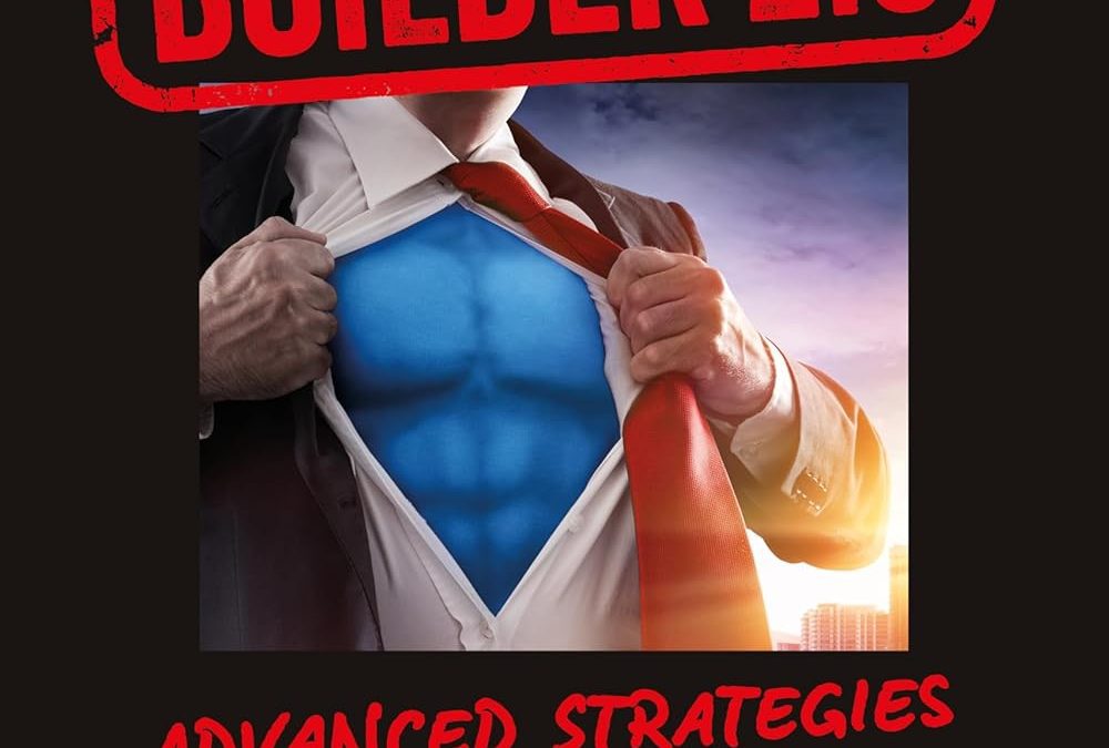
Superhero Stock Overload
The central image—man tearing his shirt open to reveal a fake blue chest—wasn’t edgy in 2005. Today, it reads like a relic from a PowerPoint clip-art museum. It signals desperation, not authority. -
Red Rubber-Stamp Title
The phrase Million Dollar Builder 2.0 is slapped in bold red like a rejected mortgage document. Oversized, off-center, and visually jarring. -
Font Family Feud
Four competing fonts fight for attention: a corporate sans-serif, red handwritten urgency text (“IN 3 YEARS OR LESS!”), and two others thrown in for chaotic flair. -
Zero Hierarchy, All Confusion
No visual flow. The eye doesn’t know where to focus next. Title, subtitle, image, tagline—all piled in with no cohesion.
Why It Misses the Mark
-
Target Audience Betrayal
This is supposed to be a playbook for serious business builders. Instead, it looks like an outdated webinar flyer aimed at MLM moguls. -
Trust Erosion
A professional business book needs credibility from the first glance. This cover begs you to ask: “Is this even real?”—not exactly the reassurance authors want. -
Missed Branding Opportunity
Instead of dusty clichés, visuals like blueprints, tools, structural lines, or architectural diagrams would better resonate with the audience.
What the Author Could Build Instead
-
Use tools or building materials in the visuals to anchor the genre.
-
Stick to two fonts max and let them speak confidently, not scream.
-
Replace overly dramatic stock metaphor with authentic imagery: real construction, clean lines, smart layouts.
-
Aim for trust and clarity—not flashy jargon or superhero wannabe.
Final Verdict
This cover fails at its job. It tries to grab attention but forgets clarity and credibility. If your aspiration is to help builders reach seven-figure net profits, don’t start with a cheap design that scares them away.