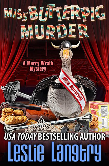
Imagine you’re a humble goose, just trying to win a local poultry pageant when suddenly—bam! You’re the central figure in a visual crime scene. Welcome to the cover of Miss Butterpig Murder, where chaos reigns, the graphics scream, and the only thing getting slaughtered is good design.
Let’s start with the star of the show: Miss Butterpig herself. Or rather, a goose in a sash. And not just any sash—one where the words “Miss Butterpig” have been so obviously cut and pasted onto the fabric, it’s like the designer gave up halfway through the job and said, “Good enough.” Except it’s not. The text floats flatly on top of the curve with zero attempt to match the contour, warp, or lighting. It doesn’t even try to look like it belongs. The sash is cosplay. The text is ransom note.
Now let’s talk about the overall composition: a smorgasbord of clipart-quality objects haphazardly slapped together like a crime scene staged by a preschooler with Photoshop. We’ve got:
-
Dumbbells
-
A tiara
-
Girl Scout cookies
-
A goose with attitude
-
A toy-sized revolver
-
A theater setting that’s somehow both lifeless and off-topic
Every item looks like it was pulled from a different stock photo library and placed on the stage without any attempt to unify light source, perspective, or tone. The cookies and weights have one lighting setup. The goose has another. The red curtains have a lighting temperature from another dimension. We’re not just mixing metaphors—we’re mixing entire visual realities.
Let’s not ignore the typography, which is having its own identity crisis. The title has that retro carnival 3D effect, which might work—if the rest of the fonts didn’t rebel. “A Merry Wrath Mystery” is in basic sans-serif pink, floating unanchored. “USA TODAY BESTSELLING AUTHOR” is bold white and screaming for attention. The author name is in an odd font that’s stretched across the width like it’s afraid of the bottom edge. It’s the design equivalent of everyone shouting over each other at a PTA meeting.
And can we talk about tone? A cozy mystery should feel light, clever, and inviting. This feels like a satire of a satire that lost its way halfway to the Photoshop toolbar. The curtain implies theater, but the stage is filled with gym equipment and baked goods. Are we at a murder trial or a talent show? No one knows. Least of all, the cover.
To be fair, cozy mysteries often lean into the absurd. That’s the charm. But there’s a difference between intentionally quirky and accidental mess. This isn’t whimsy. This is a design breakdown.
Final verdict? This cover is less “merry wrath,” more “graphic design wrath.” Miss Butterpig deserved better. So did we.
