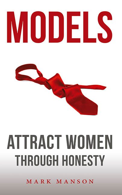
If Models: Attract Women Through Honesty is a book about emotional depth and vulnerability, then someone really should’ve told the cover — because it’s over here delivering the visual equivalent of a monotone TED Talk on charisma given by a man wearing Axe body spray and crippling insecurity.
Let’s start with the centerpiece: a limp, aggressively red necktie, laid across the page like it just gave up halfway through being seductive. It’s not sensual. It’s not bold. It looks like it was yanked off during a mildly heated HR-approved makeout scene on a CW drama, then left behind in a WeWork conference room.
And then there’s the title. “MODELS” looms in bold red all-caps, dominating the top half like it’s shouting at you to respect its alpha energy. Below it, in cold grey sans-serif, we’re offered the subtitle: “Attract Women Through Honesty.” A noble sentiment, sure — but one that’s completely undercut by the cover’s aesthetic commitment to bland masculinity and 2006 PowerPoint design principles.
Typography-wise, it’s the Holy Trinity of corporate cringe:
-
One massive, shouty headline
-
One sad grey subhead
-
One confused little author name in red, just… hanging out down there like it showed up to the party in the wrong dress code
And that background? It’s white. Just white. Not clean, not minimalist, just white space as a design shrug. This isn’t purposeful simplicity — it’s a layout that gave up on emotion, theme, or nuance entirely. It’s trying to whisper “honest masculinity” but ends up screaming “I built this in Word and I stand by it.”
The overall vibe is early 2010s “dating guru” blog meets self-help pamphlet from a motivational speaker who peaked during a podcast interview called “The Hustle Path.” You can practically hear the word “framework” being said 12 times per chapter.
And the tie. Again with the tie.
Why is it there? What does it symbolize? Confidence? Casual formality? Emotional unraveling? Or did someone just Google “masculinity object red background isolated PNG” and roll with the first result?
This isn’t “Attract Women Through Honesty.” This is “Alienate Designers Through Stock Photo Fatigue.”
Final score: 1 sad tie, 0 visual charisma, and 100% corporate energy with no soul.
Try again, Mark. Maybe next time… loosen the tie before you design the cover.
