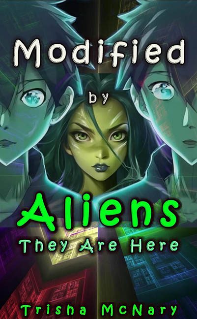
There are book covers that invite curiosity, some that provoke intrigue, and then there are covers like Modified by Aliens: They Are Here, which kick down the door, spray neon slime everywhere, and demand your attention with all the subtlety of a glow stick at a funeral.
Let’s start with the typography, because it refuses to be ignored. The word “Aliens” arrives in radioactive green bubble letters that look like they escaped from a 1999 sci‑fi arcade cabinet. It is large, loud, and aggressively unserious, glowing like it has just been dunked in antifreeze. Above it, “Modified by” floats in a completely different font, rounded and playful, like a children’s sticker book. Below, “They Are Here” gives up entirely and settles into yet another typeface. Three fonts, zero agreement, and not a single one asking whether it belongs on a book cover.
The colour palette is an all-out assault. Neon green text clashes violently with electric blues, purples, and sickly yellows. There is no harmony, no restraint, and no moment where the eye can rest. This is not visual tension; this is colour theory being actively ignored. It feels less like a design choice and more like every slider was pushed to maximum and left there out of spite.
Then we arrive at the imagery, which appears to be AI-generated or heavily filtered digital art masquerading as illustration. The central alien figure stares out with an uncanny, plastic smoothness, her features hovering somewhere between anime, mannequin, and low-budget video game cutscene. The two flanking human figures are semi-transparent, ghosted into the background like afterthoughts. Their faces are cropped awkwardly, their expressions blank, their presence confusing. Are they important? Are they decorative? Even the cover seems unsure.
Layering is another casualty here. Characters overlap text, text overlaps background circuitry, and nothing is clearly foreground or background. The composition collapses inward, creating a cluttered vertical stack where every element fights for dominance and nobody wins. It is visual noise disguised as sci‑fi intensity.
The background deserves a brief mention, mostly for existing. Abstract shapes, glowing grids, and vague technological motifs drift behind the characters, contributing nothing except additional clutter. It reads like stock sci‑fi wallpaper thrown in to fill space rather than support a cohesive concept.
What ultimately seals this cover’s fate is its complete lack of polish. This is not campy on purpose. This is not parody. This is earnest design that never learned when to stop. It feels like a first draft that skipped the crucial step of stepping back and asking whether any of this works together.
Modified by Aliens: They Are Here is a perfect storm of amateur typography, clashing colours, AI uncanny valley art, and chaotic composition. It does not invite the reader in; it shouts at them from across the room while glowing aggressively. If the aliens are here, they have not come in peace. They have come for graphic design, and they have left no survivors.
