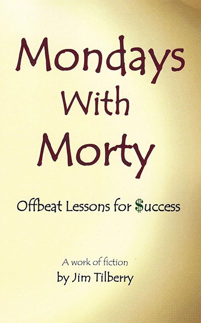
If you’ve ever wondered what happens when you mix a motivational poster, a dusty printer, and a touch of fonts-you-should-never-use, behold the design catastrophe that is Mondays With Morty. This isn’t just a bad cover—it’s a full-blown beige cry for help. It wants to be quirky. It wants to be satirical. But what it delivers is the visual equivalent of someone shrugging their way through a book report.
Let’s start with the background, which appears to be… paper? Maybe parchment? No—upon closer inspection, it’s just beige sadness, textured like an old wall in a forgotten waiting room. There’s no imagery, no shading, no visual interest whatsoever—just a slow fade into “Are we sure this isn’t a flyer for a free seminar at a community center?”
Now to the typography, which is where this cover truly goes off the rails. “Mondays With Morty” is set in a whimsical, clunky font that would look more at home on a second grader’s Halloween invitation. It’s trying to say “fun and offbeat,” but ends up screaming “first time using a font menu.” And then there’s the subtitle: Offbeat Lessons for $uccess. Yes, that’s a dollar sign shoved into the word like a sad attempt at clever branding. Nothing says “original insight” like borrowing design logic from early 2000s spam emails.
And just when you think the font choices couldn’t get worse, the author’s name is introduced in yet another typeface—because why commit to one bad decision when you can make three? It’s centered, floating near the bottom like it’s trying to sneak off the page without drawing attention. Which, honestly, we can’t blame it for.
The overall composition is nonexistent. No imagery. No visual cues. No hierarchy. It’s as if someone opened a Word document, typed five lines, and said, “Yeah, this is probably fine.” It’s not minimalist. It’s not intentional. It’s accidental austerity, and not in a charming way.
Now let’s talk genre confusion. Is this satire? Is it self-help? Is it fiction? The cover gives zero clues. It tries to be ironic with “A work of fiction” printed at the bottom, but with a cover this bland, the joke flies so far under the radar it’s tunneling.
This isn’t a cover—it’s a beige void with identity issues. A book about “offbeat success” should radiate bold choices, energy, even a bit of risk. Instead, Mondays With Morty settles for design-by-apathy.
If this is the gift of Morty’s mentorship, we’d like to respectfully return it to sender.
Some lessons should stay off the shelf.
