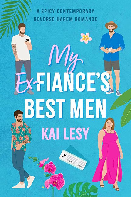
Tropical? Check. Reverse harem? Check. Graphic design? Nope. What we have here is a romantic comedy cover that looks like it was cobbled together during a layover in Canva hell. My Ex-Fiancé’s Best Men is a spicy contemporary romance, but the cover screams “graphic design is my part-time enemy.”
Let’s begin with the font mash-up, a typographic love triangle that no one asked for. “My” is scrawled in a hot pink handwritten script, looking like it was yanked from a bubblegum brand circa 2003. “Ex” is angrily scratched out like it just lost a custody battle. Then “FIANCÉ’S BEST MEN” arrives in a bold sans-serif that’s somehow both rigid and lost at sea. It’s not hierarchy, it’s Helvetica held hostage.
And oh, the illustrated characters. They’re the graphic equivalent of four strangers trapped in a single group chat. We’ve got:
-
Hawaiian Shirt Hipster
-
Denim Shorts Dad Bod
-
Sad Tech Bro Scrolling Tinder
-
And… Woman in Pink Who’s Not Sure Why She’s Here
Each figure looks like it was summoned from a separate lifestyle app, then sentenced to coexist in this bright-blue beachscape of confusion. Their shadows don’t match, their outlines don’t match, and their vibes? They definitely don’t match. It’s like an improv troupe got stranded on a cruise.
But wait—what’s this? A random boarding pass floating at the bottom! Because if there’s one thing this cover was missing, it was travel clipart from a discount power-point template. Also starring: stock orchids, vector palm fronds, and a single lonely plumeria flower acting as the visual equivalent of “oops.”
The overall aesthetic attempts to whisper “fun, sexy chaos” but instead mumbles “Pinterest mood board meltdown.” It’s tropical, yes—but only if you count being trapped in a souvenir shop filled with design regrets as a vacation.
Romance deserves better. Typography deserves better. We all deserve better.
This isn’t a reverse harem—it’s a design intervention.
