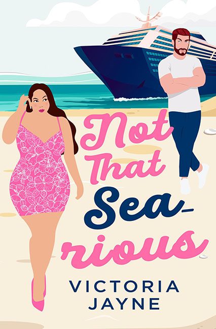
Rom-com covers should sparkle, pop, and maybe even make you laugh before you turn the first page. Not That Sea-rious does none of these things. Instead, it looks like a coloring book page that accidentally wandered into Canva, slapped on some fonts, and called it a day.
Let’s start with the “couple.” Our heroine is mid-strut, phone in hand, rocking a pink floral dress that looks more like wallpaper sample #47 than actual fabric. She’s supposed to be bold and stylish, but instead she looks like clipart labeled Sassy Woman Talking on Phone (Insert Here). And our “leading man”? He’s standing in the background with his arms crossed, glowering like a Ken doll who just lost his job at the yacht club. Their chemistry together? About as lively as a cardboard cutout couple at a department store display.
But the real star here is the Cruise Ship of Doom. This thing looms behind them like a predator, parked so absurdly close to shore it looks ready to flatten them in one rogue wave. It’s less romantic backdrop and more Titanic II: Revenge of the Lido Deck. You can almost hear the foghorn blasting “abandon cover!”
And then there’s the typography. Not That is scribbled in cotton-candy pink cursive, while Sea-rious is a thick, blocky blue font trying to punch the pun into your face. It doesn’t read whimsical, it reads desperate. The fonts don’t harmonize, they clash like karaoke night at a dive bar. It’s as if two designers fought over which font to use and both won — to our eternal loss.
Final result? A cover that looks less like a romance novel and more like a promotional poster for a discount singles cruise where the main mystery is whether the boat will hit land before the readers hit the exit button.
Verdict: A horrible cover through and through — bland, clunky, and about as sea-worthy as a rowboat made of cardboard.
