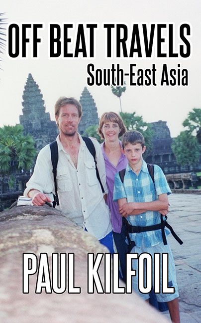
Ah yes, nothing says “Off Beat Travels in South-East Asia” like a washed-out family vacation photo from your uncle’s Canon PowerShot circa 1999.
This cover boldly goes where every travel guide should never go: straight into the family scrapbook. It’s giving “Dad just figured out how to email pictures,” not “buy this published memoir.” Let’s dive into this tropical design meltdown, shall we?
Let’s start with the photo.
We have three individuals—presumably the author and family—posed stiffly in front of one of Cambodia’s most iconic landmarks, Angkor Wat. But instead of awe-inspiring wonder, we’re served a visual cocktail of awkward posture, sunburn, and what looks like peak humidity-induced misery. The boy in the front looks like he just lost a Pokémon card, the mom’s giving hostage smile, and dad’s backpack straps are doing all the heavy lifting—literally and compositionally.
And then there’s the font.
It’s like someone discovered the “Impact” typeface and thought, “Yes. This will make my title scream exotic adventure!” But it doesn’t scream. It wheezes. Giant, clunky, center-aligned, and dropped on top with no thought for color harmony or balance. It’s practically shouting over the scenery—rude.
“South-East Asia” is thrown in like an afterthought.
Just floating there, middle-aligned like it’s trying to squeeze between two party guests who already hate each other. Why is it on a second line? Who approved this spacing? Did anyone approve this spacing?
Let’s not ignore the lighting.
The photo’s exposure looks like it lost a fight with an overzealous Instagram filter. The whites are blown out, the colors are flat, and the whole image is faded like it’s been sitting in a drawer since Y2K. Where’s the vibrancy of Southeast Asia? Where’s the allure? This looks like you accidentally sat on the photo before scanning it.
So what’s the vibe here, really?
It’s giving middle school PowerPoint presentation. It’s giving trip to the post office, not a journey through Southeast Asia. If the goal was to design a cover that makes the most culturally rich region on Earth look like a soggy family day trip, mission accomplished.
Final thoughts:
Travel books should inspire. They should feel immersive, exciting, alive. This? This feels like a wet sock. You have a whole continent of design inspiration to pull from, and you gave us a vacation slideshow.
Someone please take the camera away from Dad. And the font menu. And possibly the publishing software.
