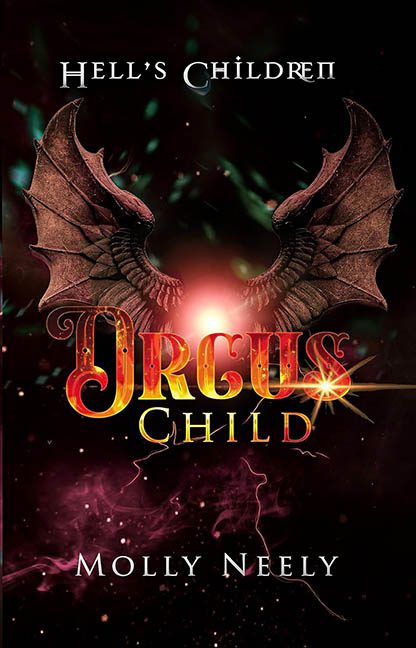
Welcome to the blazing gates of graphic design purgatory, where gradients go to die and fonts party without adult supervision. Today’s catastrophe is Orcus Child — a cover that feels like it was conjured during a late-night design séance using nothing but a cracked copy of Photoshop CS2, a bag of dollar-bin fantasy assets, and the full power of the Bevel & Emboss panel.
Let’s dive right into the molten lava pit that is the title design. “ORCUS” is screaming in red-gold metallic, drenched in bevels, shadows, highlights, and a glowing sunburst that explodes from the “D” in “CHILD” like it’s trying to distract us from the rest of the crimes happening here. The font is a baroque fever dream — curls, flares, fiery tones — it’s got everything except restraint. Meanwhile, “CHILD” wanders in like it just came from a different book entirely. It’s set in a dull, standard serif that looks like it was added by someone who forgot to turn off the default setting after rendering the title in lava chrome. Together, they’re not a duo — they’re a design divorce.
Hovering above all this chaos is the subtitle “HELL’S CHILDREN,” quietly styled in plain, off-the-shelf uppercase like it’s ashamed to be here. That’s probably fair.
Now for the visual centerpiece: a pair of dragon wings so tragically cut-and-pasted they might actually flap away out of sheer embarrassment. They float in midair, unattached to any creature, anatomy, or logic. Are they symbolic? Literal? Vestigial design regrets? No idea. They’re just… there. And they’ve been lit with all the finesse of a flashlight under a blanket. The shadows don’t match the background, the wings have no depth, and the rendering looks like it was yanked from a mid-2000s fantasy MMO startup screen.
Surrounding this mess is a smoky, sparkly nebula that might be space dust or demonic glitter — we’ll never know. Green lightning streaks through the background like it wandered in from a different genre, and the pink haze swirling around the bottom looks like someone spilled a vape pen over the underworld.
Let’s not forget the color palette, which runs the full range from blood red to electric green to bubblegum pink, all wrapped in a gloss so aggressive it might qualify as an environmental hazard. The composition isn’t just busy — it’s an all-out brawl, with fonts, wings, light flares, and visual noise fighting for dominance in a realm of zero contrast and negative clarity.
In conclusion, Orcus Child isn’t just a bad cover — it’s a demonic design talent show where every element is trying to win Most Dramatic. And spoiler alert: nobody wins.
