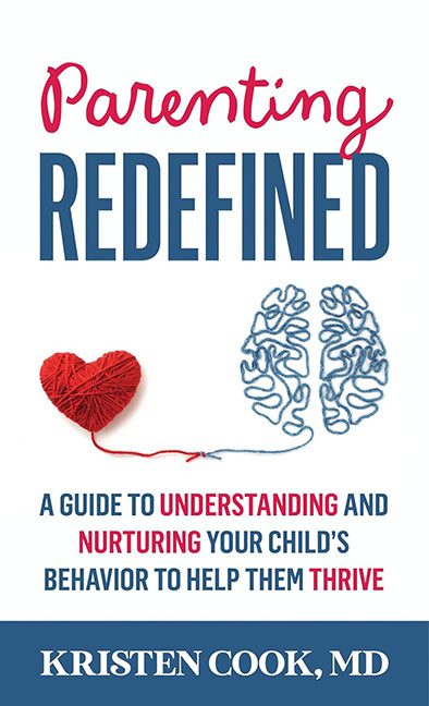
If you’ve ever wondered what would happen if a medical pamphlet and a Pinterest craft tutorial had an identity crisis, look no further than Parenting Redefined. This cover isn’t just redefining parenting — it’s redefining what it means to throw every mismatched design element at a white background and hope for the best.
Let’s begin with the tragic romance between the heart and the brain — both constructed from yarn, because apparently nothing says “cutting-edge child psychology” like DIY string art. This image tries to scream emotional intelligence, but instead, it whispers, “I was made in Canva at 2 a.m.” The heart is red. The brain is blue. And the metaphor? About as subtle as a tantrum in a toy aisle.
Now let’s talk typography. “Parenting” is in a cursive font reminiscent of elementary school bulletin boards, while “REDEFINED” shouts in all caps like it’s trying to sell you a midlife crisis in hardcover. The subtitle below reads like a rejected tagline from a self-help seminar: “A Guide to Understanding and Nurturing Your Child’s Behavior to Help Them Thrive.” That’s a whopping 16 words of buzzword soup, stacked awkwardly and designed with all the elegance of a refrigerator magnet ransom note.
Then there’s the color scheme. Red, blue, and navy are all fine in theory — but here, they’re doing nothing but stepping on each other’s shoelaces. Red is randomly emphasized like someone sneezed on the highlight tool, and blue gets demoted to backup dancer status despite being the color of half the imagery.
The overall effect is a visual argument between a children’s therapist and a marketing intern, and nobody’s winning. The white space isn’t calming — it’s empty, like the budget for this design. It’s not clean minimalism; it’s “we didn’t know what else to do.”
In short, this cover is the equivalent of a well-meaning but chaotic parent: lots of effort, zero coordination. If the goal was to redefine what not to do in book design, mission accomplished.
