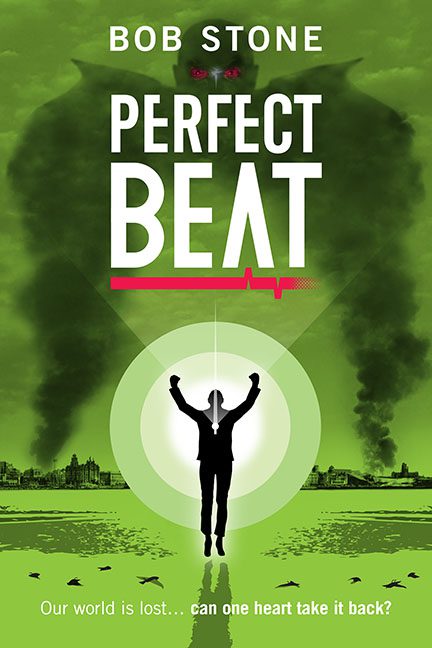
If Perfect Beat were a song, it would be the kind that clears the dance floor. You know — the one where the DJ insists, “No really, it drops in a minute,” but the only thing dropping is the collective will to live.
Bob Stone’s Perfect Beat is a masterclass in what happens when design confidence outruns design skill. It’s got ambition, sure — but it’s the kind of ambition that says, “I can totally build a spaceship,” right before duct-taping a trash can to a Roomba.
Let’s begin with the color palette. Green. Just… green. An all-consuming, end-of-days, highlighter-in-a-nuclear-reactor kind of green. If aliens were to send us a warning about bad design choices, it would probably look exactly like this. The hue is so intense it could power a small rave — or a toxic waste spill. It’s hard to tell which.
Then there’s the central figure: a black silhouette of a man, frozen mid-celebration like he just found cell service in the apocalypse. His body language says “YES! I did it!” but what he did, exactly, remains unclear. Stopped the end of the world? Summoned the shadow of an angry smoke demon? Won a free smoothie at Planet Fitness? The possibilities are endless, and all of them weird.
Behind him looms the real MVP of confusion — a gigantic, vaguely humanoid monster made of clouds, pollution, or possibly a bad dream rendered in Microsoft Paint. It’s meant to be terrifying, but its edges are so soft and fuzzy it feels more like a smog warning than an existential threat.
And then, the typography — “PERFECT BEAT” blares across the center in a sans-serif so rigid and sterile it could double as hospital signage. Just in case the metaphor wasn’t literal enough, there’s an electrocardiogram line stabbing through the word “BEAT,” because nothing says pulse-pounding sci-fi like visualizing heart failure.
Below that, in a tragic twist of optimism, the tagline reads: “Our world is lost… can one heart take it back?” Bold words for a book whose cover looks like it was designed by a defibrillator. It’s the kind of line that sounds powerful until you realize it’s basically a gym poster for emotional cardio.
And let’s talk about composition. The big circular glow around our hero could have been a beacon of hope — but instead, it looks like he’s being abducted by the moon, or caught in the world’s most passive-aggressive spotlight. His reflection below, mirrored in that radioactive lake, adds a surreal touch, but not in the good way — more like “Did my printer run out of cyan ink halfway through?”
To top it all off, we get faint city ruins in the background — a subtle reminder that the world has ended, but not nearly as badly as the graphic design on this cover.
Perfect Beat wanted to be epic. It wanted to pulse with energy, urgency, and meaning. Instead, it flatlined halfway through the first draft of the concept art.
If this cover has a heartbeat, it’s irregular — a visual arrhythmia that leaves your eyes twitching and your soul wondering whether you’ve been subliminally recruited into an EDM cult.
In short: Perfect Beat is the sound of a design department dancing to the rhythm of chaos — one poorly kerned, nuclear-green note at a time.
