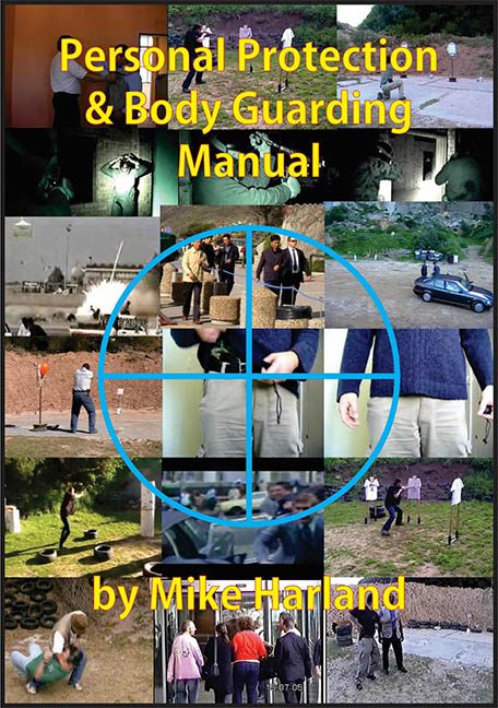
Somewhere, deep in the bowels of outdated desktop publishing software, this cover was born — a Frankensteinian collage of grainy JPEGs, bold yellow fonts, and sniper crosshairs that scream, “I made this myself and I regret nothing.” Welcome to Personal Protection & Body Guarding Manual by Mike Harland — the most chaotic cover in tactical publishing.
Let’s get the obvious out of the way: this cover looks like someone threw Google Image Search results into a blender and then pasted the remains onto a Word document from 2004. It’s a 4×5 grid of visual confusion — and every image looks like it was taken from a different century, using a different device, by a different person. Want to see someone jumping tires? It’s here. How about someone… standing near a sedan in a gravel pit? Got that too. Tactical confusion achieved.
The center “design element” is what we’ll generously call a “scope overlay.” A blue, semi-transparent crosshair placed off-center — naturally — to frame some random torsos. This isn’t design; this is what happens when a WordArt enthusiast gets their hands on Microsoft Paint and a collection of VHS surveillance tapes.
The title text? Oh, dear. We’re talking yellow and red bold sans-serif slapped right over busy photographs, with no outline, no drop shadow, no contrast consideration whatsoever. It’s the graphic design equivalent of shouting instructions over a jet engine. The subtitle “by Mike Harland” in the same glaring font color means there’s absolutely no visual hierarchy. Nothing is prioritized. Everything is screaming at once — which, to be fair, is a vibe.
You know how design instructors teach students about negative space, balance, and focal point? This cover is the anti-lesson. It’s what happens when you ignore all three and instead decide to cram every possibly relevant image onto one canvas, just in case the reader has X-ray vision and ADHD.
Is this supposed to be a professional manual? Because it looks more like a “DIY protection zine handed out behind a gas station” than something anyone should rely on for their safety. The whole thing is giving “PowerPoint presentation from 1999 with 100 transitions and a MIDI soundtrack.”
This isn’t tactical.
This isn’t professional.
This is visual mayhem — and not in the cool, “Jason Bourne escape scene” kind of way. More like Jason Bourne’s uncle just discovered Canva.
Final Thoughts:
If you’re trying to disappear into the shadows as a bodyguard, this cover will blow your cover from three continents away. The only thing being protected here is good design — by keeping it far, far away.
Let’s hope the content inside teaches better spatial awareness than the layout on the outside.
Would you trust someone with your safety who thought this was the best visual representation of professionalism?
Exactly.
