
What Went Horribly Wrong?
1. Zero Visual Cohesion
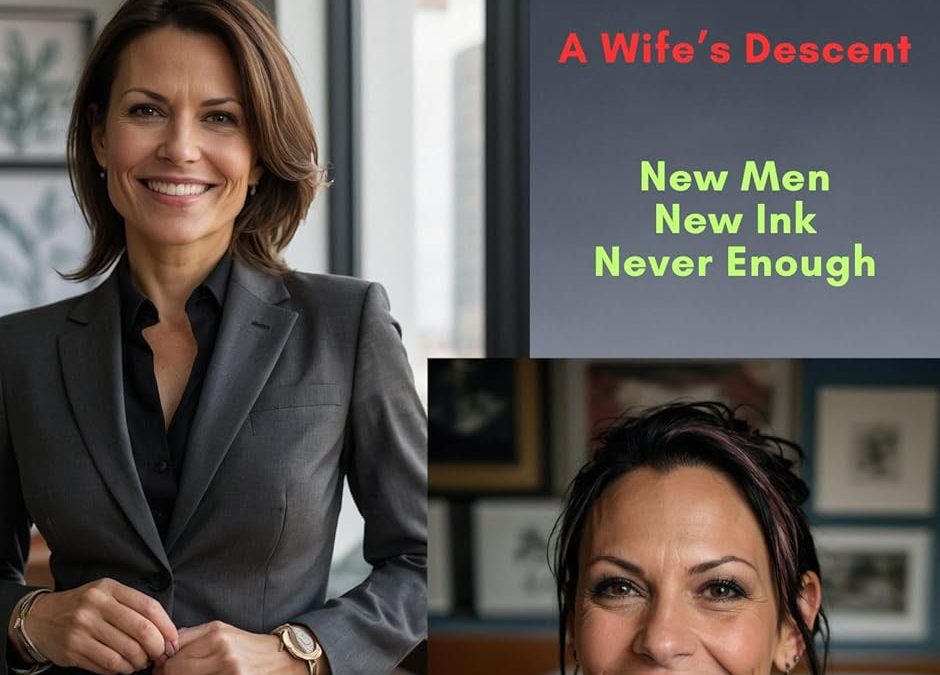
- This cover commits a cardinal sin of design: looks like it was built with PowerPoint in 1997.
- It uses three different image zones like it’s a high school project, not a professional book cover. The smiling stock photo of a businesswoman and tattooed woman suggest LinkedIn profile meets biker dating site—totally inconsistent with the dark, erotic descent implied in the title.
2. Typography: A Mismatched Disaster
- Title in bold red Helvetica screams corporate sales report, not an erotic or dramatic novel.
- Subtitle (“A Wife’s Descent”) and teaser lines (“New Men / New Ink / Never Enough”) are not only randomly placed—they clash in color, size, and tone.
- Author name? Script font in pink, with no context to the rest of the cover, tossed into a pale background box like an afterthought. It lacks any contrast, polish, or placement logic.
3. Misleading Tone & Audience Confusion
- This looks like a case study cover for HR training until you read the title.
- The title suggests erotica or psychological drama—but the visuals? Corporate headshot + smiling tatted lady = lifestyle blog or wellness feature.
4. Zero Composition Planning
- The image blocks feel like a last-minute template patch job—no focal point, no visual hierarchy, no rhythm.
- Why is the businesswoman image so dominant? Is she the same person as the tattooed woman? If so, why is this transformation not dramatized?
Final Verdict: “From Canva to Catastrophe”
This cover utterly fails to convey tone, genre, or narrative. It misleads, distracts, and confuses in equal measure. It’s a mashup of inappropriate stock photography, cheap fonts, and no visual storytelling.
Score: 1 out of 10 — Should be passed around… to every design school as a warning.