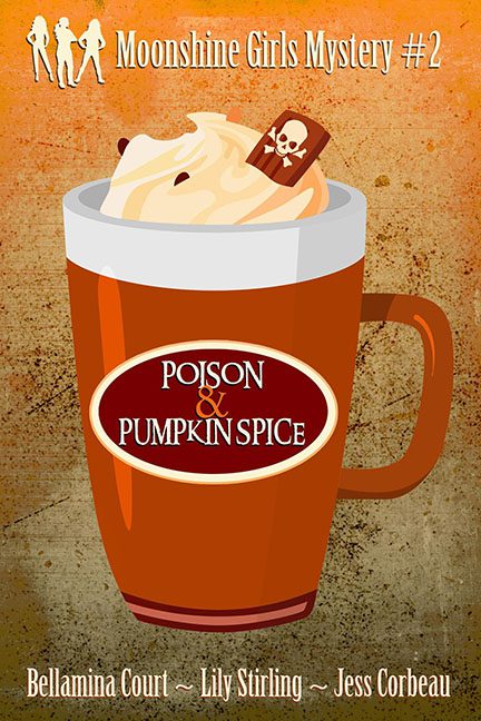
Pumpkin spice may be the flavor of fall, but this cover is more like the taste of regret. “Poison & Pumpkin Spice” promises a cozy mystery, but what we get is clip art masquerading as design. That latte mug could’ve been ripped straight from a Word 2003 stock library, complete with flat fill colors and the charm of a DMV pamphlet.
And then there’s the pièce de résistance: the chocolate garnish with a skull-and-crossbones sticker slapped on top. Subtlety? Never heard of her. Instead of letting the title or mood do the work, this cover screams, “LOOK, IT’S POISON! SEE THE SKULL? GET IT?!” It’s like a murder mystery for toddlers.
The typography isn’t helping either. The title is crammed into a gas-station-coffee-style oval logo, making it look less like a book cover and more like a pumpkin spice K-cup label. The ampersand in the middle seems especially lost, as though it wandered in from a different design entirely and decided to stay.
Then we’ve got that background. Rust-stained wall texture? Nothing says cozy mystery like the ambiance of a condemned basement. Between that and the Moonshine Girls Mystery silhouettes—three generic stock ladies strutting across the top like they wandered off a clip art fitness brochure—it’s a case of lazy branding gone horribly wrong.
Cozies are supposed to feel charming and inviting, like a warm kitchen with cookies cooling on the counter. Instead, this one feels like being handed a mug of gas station latte in a dark alley, with a stranger whispering “it’s pumpkin spice… and cyanide.”
If pumpkin spice is a seasonal obsession, this cover is the seasonal intervention.
