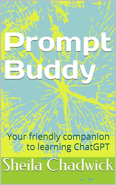
Prompt Buddy promises to be “your friendly companion to learning ChatGPT.” What it delivers on the cover, however, looks less like a helpful guide and more like the result of asking a malfunctioning AI to “design me something… anything.”
The background sets the tone immediately: a neon yellow-and-baby-blue explosion that looks like it came straight off a Windows 95 clipart CD-ROM. It’s not inspiration. It’s not creativity. It’s a toxic spill in abstract form. If this is what learning prompts feels like, then we all need safety goggles.
Then we move to the fonts—because why have one when you can have three, all competing for attention in their own awkward ways?
-
Prompt Buddy is done in a clunky sans serif so thick and clumsy it could double as a refrigerator magnet.
-
The subtitle is hiding in teal serif text, looking like it got lost from a church bulletin.
-
And finally, the author’s name is sitting awkwardly in a giant mustard-green bar at the bottom. Not highlighted, not elevated—just trapped, like it’s being held hostage in a graphic design ransom note.
There is no visual unity. No modern style. No sense of connection to AI, prompts, or even technology in general. Instead, this cover looks like it was made in PowerPoint by someone who thought “explosion shape + big letters = book cover.” It’s not a friendly companion. It’s an accidental fever dream.
In the end, Prompt Buddy is proof that while ChatGPT might be able to generate content, it definitely wasn’t consulted on this design. Because if it had been, the first line of advice would’ve been: “Delete this cover and start over.”
