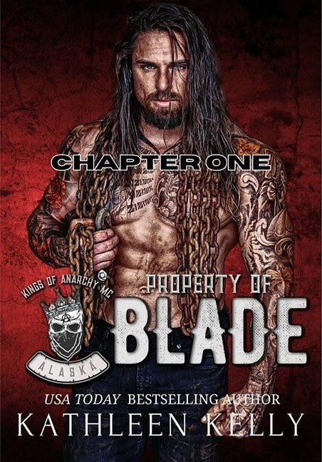
Some covers seduce you. Others intrigue you. Property of Blade walks in shirtless, dripping in chains, and growls “SUBTLETY IS FOR COWARDS” before flexing directly into your soul — and your corneas. This isn’t a cover. It’s a visual testosterone overdose that feels like it was designed entirely inside a protein shake blender set to “liquefy.”
Let’s rip off the bandage — or rather, the entire shirt — and dive right into it.
The Model:
Blade (we assume) stands front and center, a glistening monument to pecs, prison tattoos, and unwashed conditioner. His hair looks like it lost a fight with a wind tunnel. His chest is inked, oiled, and inexplicably sparkling. There’s a thick chain hanging around his shoulders, because apparently that’s just what you wear when you’re in charge of being dangerous.
He’s not looking at us. He’s looking through us. Into our souls. Past our dignity.
“CHAPTER ONE”:
Let’s address this right away.
The words CHAPTER ONE are slapped across his collarbone in what may be the single most confusing design choice of the year. Is this… a title? A formatting mistake? A bizarre flex? No one knows. What we do know is that it reads like someone accidentally pasted the inside of the book onto the front of the book and everyone just shrugged and hit publish.
The Title Block (a.k.a. “The Sledgehammer Font Suite”):
“Property of Blade” is emblazoned across his abdominals in a font that looks like it was pulled from a military dog tag and dipped in cement. This font doesn’t whisper romance — it kicks the door down and demands you file your taxes while doing push-ups.
Below that, we have the badge:
“Kings of Anarchy MC – Alaska.”
That’s right. We’re in Alaska. Land of glaciers, grizzlies, and greased-up biker boyfriends who apparently have no need for shirts but every need for aggressive graphic design.
The badge itself looks like it was borrowed from a discount Harley-Davidson knockoff, complete with a cartoon skull that’s just trying to make it through the day.
Typography Mayhem:
We’ve got at least four fonts battling it out:
-
“CHAPTER ONE” in bold sans-serif confusion.
-
“PROPERTY OF BLADE” in your standard “Apocalypse is Coming” stencil.
-
“USA Today Bestselling Author” in romance-normal italics.
-
“KATHLEEN KELLY” in an all-caps serif that’s desperately clinging to dignity.
It’s less of a typographic layout and more of a font swap speed run.
Color Palette:
Rust red, bruised black, chain grey, and spray-tan bronze. It’s giving “garage fire meets vampire nightclub.” There’s no contrast, no depth, no sense of restraint. Just wall-to-wall texture. The whole cover is so oversharpened it might file your nails if you touch it too long.
Genre? Yes. Execution? No.
This is obviously biker romance — with every trope turned up louder than Blade’s Harley. But instead of feeling bold or gritty, the result is a parody of itself. It’s not sexy. It’s not edgy. It’s the cover equivalent of someone shouting, “LOOK HOW ALPHA I AM,” while doing shirtless pull-ups in a Red Lobster parking lot.
In the end, Property of Blade isn’t a romance cover. It’s a visual assault with chain accessories. It’s not “bad boy with a soft heart.” It’s “bad design with a side of dislocated fonts.” It dares you to look away… and then punishes you for not trying harder.
Blade may own the story.
But the design? It belongs in graphic jail.
