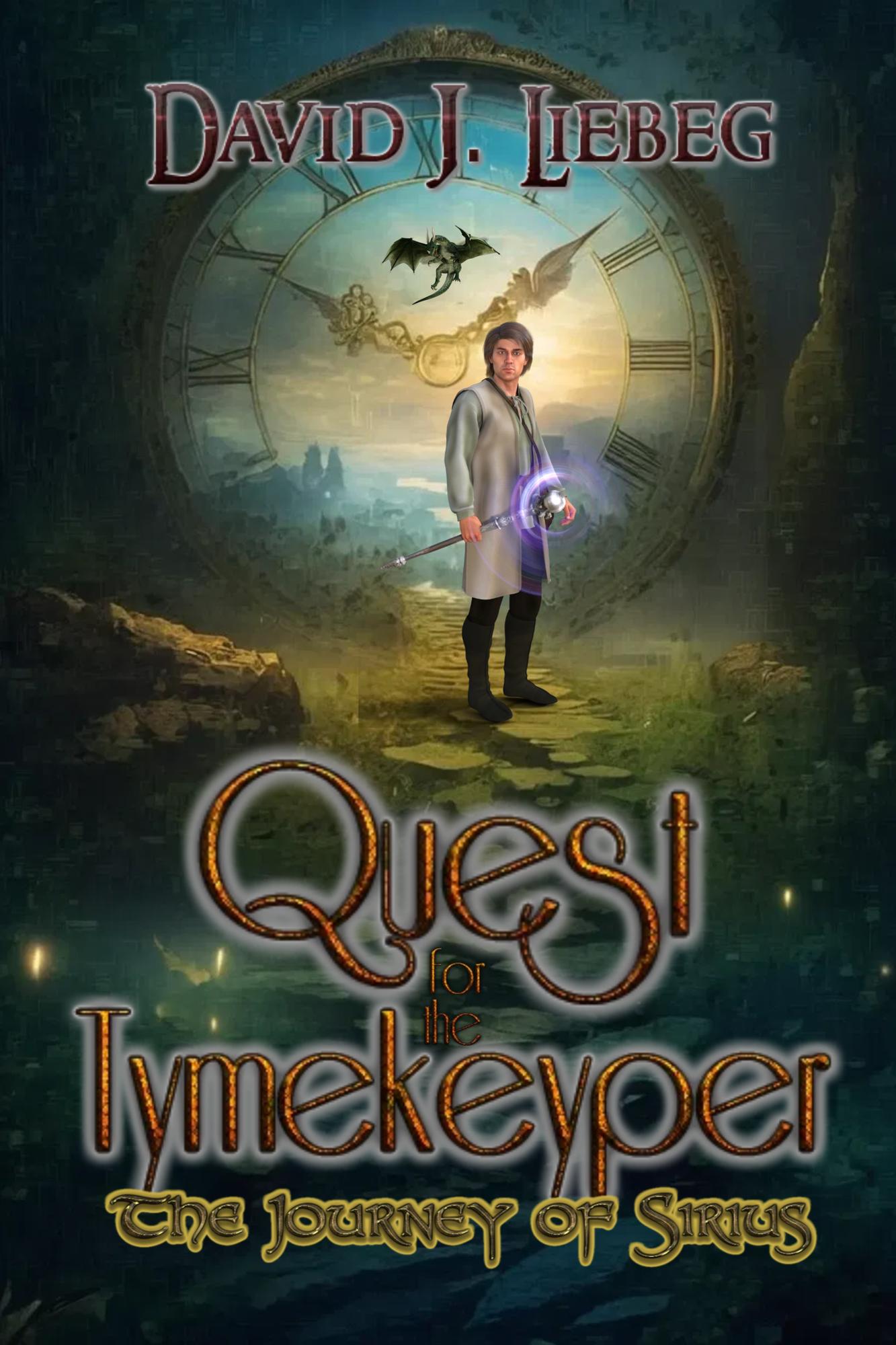
Every so often, a book cover comes along that makes you squint—not because you can’t read the title, but because your brain is trying to reconcile all the competing visual elements and failing miserably. Quest for the Tymekeyper by David J. Liebeg is exactly that kind of optical puzzle.
Let’s begin with our hero, who appears to have been rendered in an early-2000s RPG engine and then hastily dropped into a fantasy landscape using the “magic wand” tool in Photoshop Elements. He’s lit like he’s standing under a fluorescent Walmart aisle light, yet somehow placed in front of a mystical golden-hour backdrop. His feet aren’t so much on the ground as they are hovering near it—truly a wizarding feat.
Behind him looms a massive clock face (because “time,” get it?), awkwardly merged with rocky mountains and a sky that looks like it was downloaded in medium resolution from a stock image site. Just in case that wasn’t enough to convey “epic fantasy,” there’s also a dragon flying in the middle, positioned like it wandered in from a different cover entirely.
And then… the fonts. Oh, the fonts.
We’ve got at least three distinct typefaces here, each seemingly chosen from a different “Fantasy Fonts Free!” website:
-
Quest is whimsical and curly, like it belongs on a children’s fairytale.
-
Tymekeyper is rusted, glowing, and screaming “steampunk cosplay poster.”
-
The Journey of Sirius is a medieval Ren Faire flourish, because why not?
The pièce de résistance is the spelling of “Tymekeyper.” You can practically hear the author saying, “It’s not a typo, it’s worldbuilding.” Sure. And my new name is Knyght of the Spellyngs.
All together, this cover tells you everything and nothing at once. It’s fantasy, it’s steampunk, it’s time travel, it’s… something with dragons? Whatever it is, you won’t forget it—not because it’s beautiful, but because your brain will still be trying to process it three hours later.

