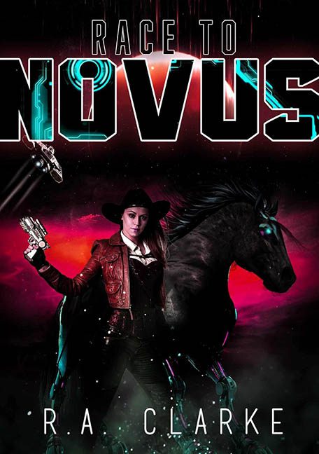
Strap in, saddle up, and prepare for liftoff into the neon-lit fever dream that is Race to Novus — a book cover that boldly asks, “What if we combined cowboys, cyberpunk, and Photoshop confusion… and then forgot to blend any of it?” This is not a race; it’s a genre pileup in a space rodeo black hole.
Let’s start with the central concept: a sci-fi cowgirl dual-wielding glowing pistols, standing next to a cybernetic space horse with glowing teal eyes and Tron streaks in its mane. It’s not entirely clear what they’re racing to, but based on the frantic energy of this composition, it’s probably a design emergency.
The heroine — our futuristic Annie Oakley — looks like she just stepped off the set of Westworld: The Cosplay Chronicles. She’s rocking a red leather jacket, a holster full of lighting errors, and twin laser pistols that glow with all the dramatic subtlety of a rave flyer. Her boots and belt are illuminated with inexplicable teal highlights, despite being in a hot pink vortex of space gas. Nothing on her matches the lighting of anything else.
Then there’s the horse. Oh, the horse. It’s either about to gallop into hyperspace or pose for a synthwave album cover. Its glowing eyes and highlighted mane scream “cyber-steed,” but the body says “stock photo of a mildly annoyed stallion.” It doesn’t look like it’s part of the same world as the cowgirl, much less the same planet.
Now let’s talk title typography — because someone really wanted you to notice the word NOVUS. It’s a bold, glowing, circuit-infused font that feels like it was ripped from a hacker movie poster and pasted above the chaos below. Meanwhile, “RACE TO” is relegated to a bland, thin font that looks like it’s trying to sneak off the page quietly. The whole title treatment is top-heavy and tonally confused — is this slick sci-fi? Wild West? Space carnival?
And don’t think we didn’t notice the two tiny laser ships flying down from the top corners like forgotten clipart, or the hot pink space fog doing its best impression of a Black Friday sale at a nebula outlet mall. These background elements aren’t world-building — they’re world-cluttering.
Even the author name, “R A CLARKE,” gets mistreated — spaced out like a ransom note and banished to the bottom with the visual weight of a forgotten footnote.
In conclusion, Race to Novus is a masterclass in unblended ambition. It has cowgirls, space horses, lasers, neon gas, and none of the restraint needed to pull them together. It’s not so much genre fusion as genre confusion — like the designer googled “sci-fi Western” and added everything from page one into a single Canva file.
This isn’t a race to Novus — it’s a race away from cohesive design.
