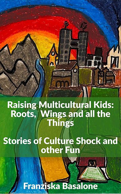
If your local elementary school art wall ever had a nervous breakdown and decided to publish a memoir, Raising Multicultural Kids: Roots, Wings and all the Things would be its crowning achievement. This isn’t just a book cover — it’s a coloring book escapee that took one look at design principles and screamed, “Not today, Helvetica.”
At first glance, it’s charming in the way that glitter glue and macaroni art can be — nostalgic, maybe even sweet. But then you realize this is not a refrigerator masterpiece held up by a magnet shaped like a cow. No, this is the actual cover of a published book, and that’s when the polite applause dies in your throat.
Let’s address the skyline first — or what I think is a skyline. It’s a mash-up of what appears to be the Alps, a medieval tower, several confused buildings suffering from architectural identity crises, and a tiny house sitting in the corner like it missed its bus to the Shire. There’s a sun, or maybe an explosion, setting behind a mountain that’s so jagged it looks like it was drawn with a tremor and a broken ruler. The entire landscape is less “global village” and more “crayon-fueled fever dream.”
Now let’s talk typography, or rather, the green emergency text bar that crashes through the painting like a bored PowerPoint slide. It screams, “We didn’t know where to put the words, so we just gave up and covered the art.” The white sans-serif font is plain to the point of being invisible, and the layout has all the elegance of a middle school science fair poster. No hierarchy, no typographic finesse — just lines of text running headlong into each other like bumper cars.
The subtitle, “Stories of Culture Shock and other Fun,” may be promising you whimsy, but the cover says “accidental surrealism.” There’s a complete disconnect between the tone of the book and the design. The chaotic artwork makes it impossible to tell whether this is a memoir, a parenting guide, or a postmodern retelling of Hansel and Gretel with a sunset migraine.
Design-wise, it ticks all the wrong boxes:
— Cluttered composition? Absolutely.
— Fridge-art aesthetic? A+ in Crayola Expressionism.
— Typography slapped on like a last-minute edit? Tragically, yes.
— Visual hierarchy? Missing in cultural action.
— Professional polish? About as polished as a tree bark collage.
And look, I’m all for celebrating children’s creativity. But slapping a chaotic mural of childhood imagination on the front of a book — without any refinement — isn’t charming, it’s confusing. This feels like the author lovingly scanned a preschool painting and thought, “Yes, this captures the multicultural journey perfectly,” when in fact it captures a rainbow implosion with churches.
To be fair, maybe this was meant to be whimsical. Maybe it was meant to be “raw” and “honest.” But when “raw” looks like it was drawn during a sugar crash and “honest” means neglecting every basic rule of layout, it becomes less of a design choice and more of a cry for professional help.
In short, this cover is a global tour of design disasters, united under the flag of Good Intentions and No Art Direction. If multicultural parenting is this chaotic, then at least the cover prepared us — but next time, maybe let the kid inside the book do the storytelling, not the one with finger paints and free rein.
Someone give this cover a juice box and send it back to art class.
