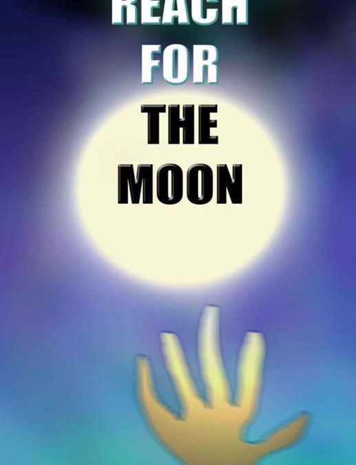

Every once in a while, a book cover comes along that captures the raw, unfiltered power of ambition — and then gently smothers it in a haze of bad gradients and design confusion. Reach for the Moon by Tuan Ho is that cover. It’s a celestial cautionary tale, reminding us all that just because you can reach for the moon doesn’t mean you should design it yourself.
Front and center, we have a glowing white circle that I can only assume is the moon, though it also bears a striking resemblance to a car headlight viewed through tears. It radiates a kind of blinding energy — the same kind that burns your retinas when you accidentally open Paint.NET at full contrast.
Emerging from below is a hand. Or at least… something hand-adjacent. Its form is an interpretive dance of anatomy — part alien, part shadow puppet, part radioactive seaweed. It stretches skyward in a gesture that says, “Help me, I’ve made a terrible mistake.” The yellow-green gradient on the fingers glows faintly, as though contaminated by whatever celestial goo is powering that moon.
And then there’s the typography, a journey in itself. “REACH FOR THE MOON” is centered directly on top of the moon, obscuring any illusion of depth and screaming its message like a motivational poster printed at 72 dpi. Each word has its own personality: “REACH” and “FOR” politely fade into white, while “THE MOON” shouts in bold black — the visual equivalent of a friend who always yells during group photos.
But the true pièce de résistance is the author’s name, “TUAN HO,” rendered in chunky 3D block letters that seem to have wandered in from a mid-’90s video game menu. It’s a strange choice for a book that otherwise appears to be aiming for cosmic introspection. Together, the fonts form a bizarre tonal soup — part sci-fi, part self-help, all confusion.
The color palette deserves its own award: bruised purples, radioactive greens, and twilight blues blend into a gradient so turbulent it looks like the universe itself has motion sickness.
Yet, somehow, amid the digital chaos, there’s something almost poetic. You can feel the earnestness. The artist truly wanted to inspire, to uplift, to shoot for the stars — and in doing so, gave us something even better: an unforgettable entry in the pantheon of gloriously bad design.
So here’s to Reach for the Moon, the cover that aimed high, fell fast, and still managed to leave a crater.
It didn’t just reach for the moon — it grabbed it, dropped it, and accidentally stepped on it.