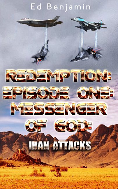
If you’ve ever wondered what happens when a fighter jet cover gets baptized in MS Paint and dipped in Chrome Gradient, look no further than this explosion of colons, clouds, and confusion.
Redemption: Episode One: Messenger of God: Iran Attacks (yes, that’s the full title, and yes, it contains four colons—more than a gastrointestinal surgery ward) is what happens when your novel wants to be a Tom Clancy thriller, a biblical prophecy, and a Top Gun reboot, but is designed by someone with access to exactly three stock images and a dream.
Let’s start with the visuals. Or rather, let’s try to decipher them.
At the top, two jets descend from heaven like disappointed archangels. Below them, two more jets appear to be either in a dogfight, crashing, or fleeing from the title font. Smoke trails hang like half-baked PowerPoint animations, refusing to follow physics, logic, or gravity. The desert landscape at the bottom is the most grounded thing in sight — and it looks like it’s waiting for the design to finish so it can go back to being in a Western.
Now, the real star of the show: the title.
A molten chrome atrocity of bevels, metallic fills, drop shadows, and glowing embers — it’s as if a Transformers logo had a heat stroke. Every word screams for attention like it’s afraid it’ll be left out of the subtitle. The font is so aggressive, it doesn’t just yell at you — it physically jostles your eyeballs.
“REDEMPTION: EPISODE ONE: MESSENGER OF GOD:” takes up nearly half the cover. And then, as if the title wasn’t already wheezing under its own weight, the words “IRAN ATTACKS” get tacked on like a forgotten Post-it note at the bottom. Totally different font, different style, and utterly abandoned by the design team. It’s a cover so loud, you can practically hear it chanting “USA!” in distorted radio static.
And speaking of inconsistency:
-
The jets are all pasted from different light sources.
-
The shadows? Invented.
-
The depth? Nonexistent.
-
The fire-and-brimstone aesthetic of the title doesn’t match the muted background — it’s like God’s wrath showed up to a documentary.
There’s also the not-so-subtle mix of military propaganda tone, apocalyptic religiosity, and patriotic clipart, all jammed together in a cover that looks like it’s auditioning to be both a sermon slide and a video game splash screen.
It’s not a book cover.
It’s a full-blown design migraine with afterburners.
So hats off, Redemption: Episode One: Messenger of God: Iran Attacks.
You didn’t just break the rules of typography. You launched a shock-and-awe campaign against every known design principle. May your colons find peace, and your jets find proper scaling.
