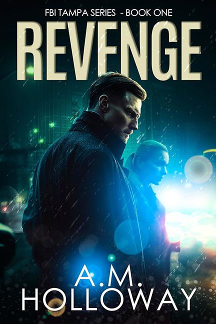
Some covers whisper subtle intrigue. Others scream “discount Netflix original.” Revenge plants itself firmly in the latter category, trying to pass off neon rain and moody trench coats as “atmospheric” when really, it’s just the stock-photo equivalent of leftover pizza.
Let’s start with the imagery: our brooding hero stands in the rain, trench coat collar popped, staring off like he’s waiting for the Uber that never came. Behind him, random neon lights and out-of-place police sirens blast the scene with so many lens flares it feels like the Photoshop toolbar exploded. Rain, glow, neon — check, check, and check. It’s not mystery, it’s an unpaid intern following a noir tutorial on YouTube.
Typography? Yikes. The word REVENGE is plopped across the top in giant beige block letters that look like they came straight out of the Impact preset. No texture, no integration, no imagination — just giant font slapped on like a sticky note that says, “Here’s the title.” Meanwhile, the author’s name in plain sans serif at the bottom looks like an afterthought from someone formatting an office memo.
And the kicker: FBI Tampa Series. Nothing says “gritty noir” like… Tampa? The mood suggests back alleys in New York, rain-soaked streets in Chicago, or maybe neon-slick Miami. But Tampa? It’s like setting The Dark Knight in a strip mall parking lot. The tonal mismatch is so strong you can almost hear the confusion.
The verdict? Revenge doesn’t pull you into a world of danger and suspense — it drops you in the middle of a discount Netflix crime drama poster where the lighting department was overpaid and the typography intern quit mid-shift. This isn’t gripping thriller energy. It’s gripping the remote and scrolling on to something better.
