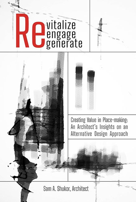
Some covers look like books. Others look like corporate brochures left behind at a conference table. Revitalize, Engage, Generate lands firmly in the latter camp — a visual reminder that buzzwords can’t build bridges, and bad design can’t hide behind Helvetica forever.
The big red “Re” is supposed to be a clever anchor, but instead it looks like the designer just rage-quit halfway through the word “Recycle.” Then we get “vitalize, engage, generate” stacked beneath in timid little lowercase letters, like interns too nervous to speak up at the pitch meeting. This isn’t typography, it’s a visual HR memo.
And let’s not ignore the subtitle. Creating Value in Place-making: An Architect’s Insights on an Alternative Design Approach. Nothing says “buy me” like a subtitle so long it needs its own ISBN. By the time you finish reading it, you’ve forgotten the title — which, to be fair, is exactly how corporate reports work.
Now, the artwork. Ah yes, the abstract black smudges. They’re supposed to be architectural gestures — sweeping structures, urban outlines, forms in transition. But what we really got was Rorschach test meets spilled coffee on graph paper. “What do you see?” “I see an architect giving up.”
Minimalism can be powerful. This isn’t minimalism — it’s unfinished homework. Wide dead spaces, disjointed grids, a sense that the designer had three different ideas and decided to use none of them properly. The result is a cover that screams “draft mode” louder than it does “published work.”
The verdict? Revitalize, Engage, Generate is less a book cover and more a corporate slide deck masquerading as design. It promises architectural insights but delivers nothing more than a buzzword wall and ink stains. This isn’t revitalized. It isn’t engaged. And it certainly didn’t generate anything but cringe.
