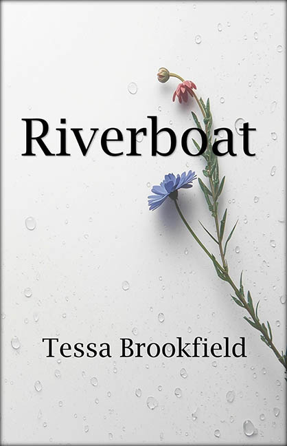
If this book cover were a sound, it would be the echo of a single raindrop falling into a beige filing cabinet. Riverboat by Tessa Brookfield promises, at the very least, a story involving water. Maybe even—brace yourself—a boat. Instead, what we get is the visual equivalent of a generic sympathy card left on the office kitchen counter.
Let’s begin with the artwork: a sad little sprig of flowers taped onto a dewy white background like it just got turned down for prom. There’s no boat. No river. Not even a puddle. The only thing this image sails is straight into the land of stock photo purgatory. It screams, “I Googled ‘delicate flower with water drops’ and didn’t scroll past the first page.”
Now, let’s talk typography—or rather, the assault on it. The title, Riverboat, is typed in what appears to be Times New Roman’s emotionally detached cousin. It’s slapped dead center in black, hovering over the stem like it’s waiting for someone else to do the heavy lifting. The author’s name, equally uninspired, is plonked at the bottom with all the finesse of a misplaced signature on a high school group project.
This is a masterclass in corporate minimalism gone rogue. It’s not elegant. It’s not modern. It’s not even trying. Instead, it hovers in the aesthetic wasteland of “we had fifteen minutes and a stock photo credit.” The entire vibe feels like someone fed an AI bot instructions for “melancholy generic fiction cover” and got back: “Here, I made this with Microsoft Publisher in 2006.”
Let’s not forget the titanic genre disconnect. Riverboat should evoke at least one of the following: water, boats, journeys, something remotely nautical. Instead, it looks like it should accompany a moody poetry collection about breakup seasons and herbal tea. Unless the titular boat is actually named “Emotional Support Stem,” we’re adrift without an anchor.
In a world full of loud, bombastic, and gloriously terrible covers, Riverboat is a quiet offender—but make no mistake, it’s still a felony against design. Not because it’s offensively bad, but because it dares to be this uninspired. It doesn’t crash and burn—it wilts and fades.
This cover didn’t just miss the boat—it never made it to the dock.
