Say Yes to the Nemesis… Or Maybe Just Say No
Rom-com covers are supposed to sparkle. They’re supposed to be charming, witty, and maybe even a little whimsical. Instead, Say Yes to the Nemesis looks like the designer mashed together three different Canva templates at 3 a.m. and thought, yeah, that’ll do. Spoiler: it didn’t.
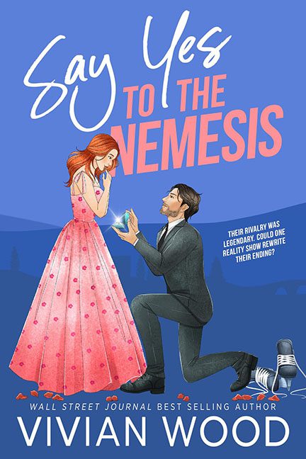
Let’s start with the characters. Our kneeling hero looks less like he’s proposing and more like he’s lunging for a dropped contact lens. His stiff suit and stiffer pose scream “Photoshop mannequin.” Meanwhile, the heroine is floating in her stiffly drawn pink polka-dot gown, gazing at the glowing cube in his hands as though he’s offering her a radioactive IKEA lamp instead of, you know, an engagement ring. Chemistry? Zero. Passion? Nada. This is less “romantic climax” and more “coworkers forced to take prom photos.”
And then we get to the typography. Oh, the typography. Say Yes is swoopy and whimsical, TO THE is shoved in like a forgotten afterthought, and NEMESIS is screaming in a blocky font that belongs on a WWE poster. None of these words look like they belong together. It’s like three fonts walked into a bar and refused to make eye contact.
The background is a lifeless sea of gradient blues, with a token city skyline tossed in for filler. But wait—what’s this? Down in the corner? A single microphone, looking like it stumbled in from a karaoke flyer. Was it meant to symbolize something? Was it supposed to tie into the “reality show” mentioned in the tagline? Who knows. What I do know is it looks like clipart someone forgot to delete.
At the end of the day, this cover commits the worst of all sins: it’s not grotesque enough to be funny, not polished enough to be professional, and not romantic enough to sell romance. It just exists—awkward, mismatched, and instantly forgettable.
Final diagnosis: This isn’t Say Yes to the Nemesis. This is Say No to Canva Template Hell.
