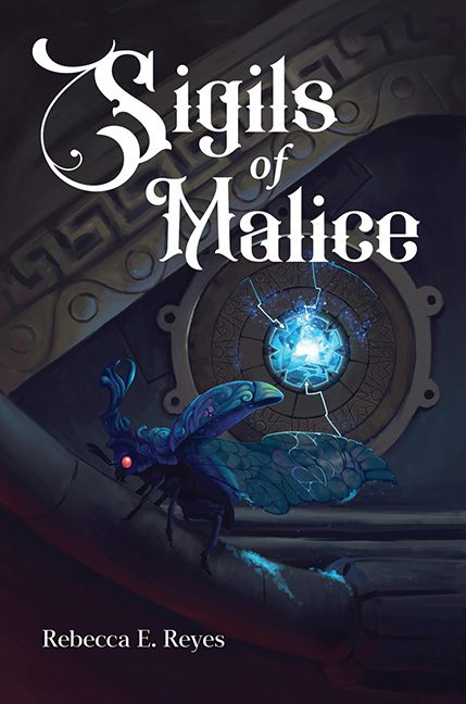
Behold, dear readers, a cover that proves sometimes fantasy doesn’t soar on dragon wings—it stumbles face-first into the nearest citronella lamp.
The title promises Sigils of Malice, but what we get instead is a glowing blue beetle who looks like he escaped from the bottom drawer of a Pokémon knockoff set. (Collect all 999 before the cease-and-desist arrives!) The creature is supposed to radiate menace, but instead it looks like it’s about to politely chirp “Sigil! Sigil!” before battling a Charmander.
And let’s talk about those design choices. The sigil itself glows like a Windows 98 screensaver—remember those swirling energy balls you stared at while waiting for dial-up to connect? Yeah, that. It’s surrounded by a chunky stone background that screams “tutorial asset from Blender” while our buggy overlord hovers in mismatched lighting like it just got photoshopped in from a completely different project.
The typography? Oh, it’s a whole other flavor of chaos. Sigils is written in a font so curly it belongs embroidered on a farmhouse throw pillow. Who knew Malice could be so… cozy? Meanwhile, the author name looks like someone opened Microsoft Word, typed it in Times New Roman, and called it a day.
Overall, the cover is trying to say: dark fantasy, ancient power, ominous stakes. What it actually says: Pokémon GO, but make it gothic.
Final Verdict: A horrible cover. When your villain looks like a collectible trading card, the only malice is what you’ve done to the fantasy genre.
