Every once in a while, a book cover comes along that doesn’t just whisper “bad design” — it kicks down the door, throws itself on the floor, and wails it at the top of its lungs. Signed Confessions by Tom Walker is one of those covers. It’s part visual confession, part design hostage note, and entirely unforgettable.
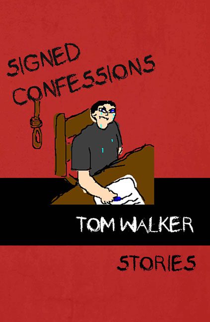
Let’s begin with the art — a pixelated figure slumped over a desk, pen in hand, presumably signing their own admission of guilt for having created this illustration. The anatomy is… interpretive. The arm appears to be melting into the table, the hand holding the pen at an angle that would alarm any orthopedic specialist. The man’s expression is one of resigned despair, his blue teardrop a symbol of regret — possibly for agreeing to appear on this cover at all.
Hovering in the corner, we find a noose, drawn with the same attention to realism one might expect from a sixth grader illustrating “Macbeth” with crayons. It’s just there — hanging out, literally — with no concern for placement, perspective, or basic emotional restraint. If the goal was “grim foreshadowing,” it achieved “MS Paint gallows clip art.”
The typography is an exercise in chaos theory. The title, Signed Confessions, looks like it was scribbled by someone writing with their non-dominant hand while riding in a bumpy bus. The author’s name sits in a solid black bar, centered with the precision of a lucky guess, while the word Stories drifts uncertainly at the bottom, as if contemplating whether it wants to be part of this mess at all.
Color-wise, we’re treated to a palette of murder-scene red and copier-toner black — bold, yes, but in the same way a fire alarm is bold. It’s the visual equivalent of a migraine with artistic ambition.
And yet, beneath all the chaos, there’s a strange poetry here. The cover feels like a confession — the confession of someone who bit off more than they could design. It’s raw, it’s tragic, it’s completely lacking in alignment.
So here it stands: Signed Confessions, a cover that’s part true crime, part art-school dropout, and all commitment. It doesn’t just ignore design rules — it burns them, then cries one pixelated tear over the ashes.
It’s not just bad. It’s existentially bad.
A visual confession of guilt from the court of graphic design — and honestly? Case closed.
