
There’s a special kind of schadenfreude in discovering that even publishers — yes, even the ones who proudly put “Publishing” in their name — can produce a cover so magnificently awkward it could double as a PSA against bad design choices.
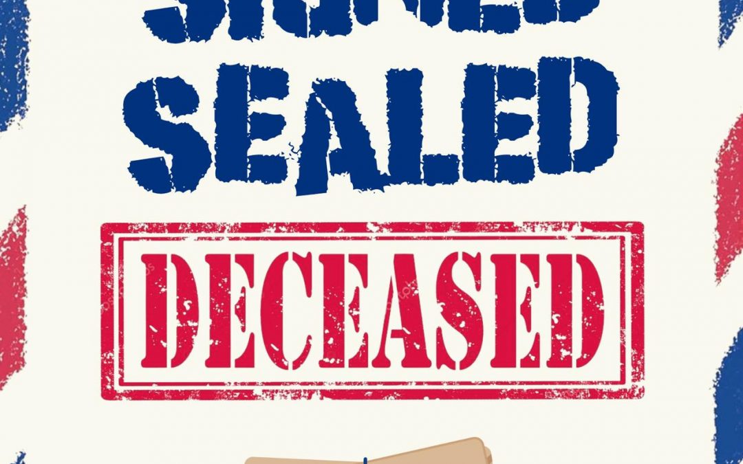
Behold Signed Sealed Deceased, a cozy mystery anthology whose visual identity appears to have been crafted during a speed round of “Design Your Book Cover Like It’s a Discount Post Office Flyer.” The patriotic airmail border shouts fun mail! while the massive red “DECEASED” stamp politely mumbles …murder, I guess? It’s as if someone merged a USPS priority envelope with a morgue toe tag and called it “branding.”
The pièce de résistance is the bundle of illustrated letters tied with a string, floating alone in the void — implying either crucial plot evidence or the fact that no one knew what else to put there. Combined with the fonts that look like they were pulled from a “Free Grunge Typewriter” pack circa 2008, it’s the design equivalent of wearing a Hawaiian shirt to a funeral.
And let’s not overlook the meta-horror here: Beaches and Trails Publishing — a small press with only this title under its belt at time of posting — still managed to make this their hill to die on. It’s comforting, really, to know that even the professionals can miss the mark so spectacularly that they circle back around to being… memorable.