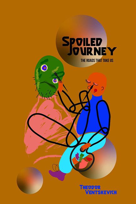
Strap in, design lovers—and haters—because Spoiled Journey is less of a book cover and more of a hostage situation between a crayon set and Microsoft Word 2003. This is not a journey gone wrong. This is a journey that never had brakes, a map, or even wheels. What we’re looking at is an abstract crime scene that somehow involves a faceless mannequin feeding a disembodied green head some existential dread through a bendy straw made of vector spaghetti.
Let’s start with the color palette, which appears to have been chosen by blindly clicking around a mood board labeled “What if nausea had a gradient?” The background is a disturbingly flat burnt orange, which—when paired with the radioactive greens and sad bruised purples—makes you wonder if the whole thing was colored using expired markers and trauma.
Now the main illustration. Is it symbolic? Sure. Is it successful symbolism? Only if the symbol is “abstract art class final project gone rogue.” The figure on the right is presumably human, though constructed entirely of black wire outlines like a haunted IKEA instruction manual. Their lovingly rendered orange head is suctioned onto a green blob that might be a face, or a Kermit the Frog chew toy that’s been microwaved. The whole setup looks like modern art accidentally sat on by a toddler.
Let’s not skip past the typography, because it’s clearly screaming for help. “Spoiled Journey” is written in a font that would be rejected by early 2000s video games for being “too try-hard.” One leg of the “N” has literally packed its bags and left the composition entirely. Beneath that, “The Roads That Take Us” looks like it gave up halfway through formatting itself. And let’s talk about the author’s name in all caps blue—nestled politely in the corner, as if it doesn’t want to be associated with any of this mess. Wise choice.
And those floating spheres? Are they meant to represent alternate realities? Artistic gravitas? Soap bubbles of despair? Regardless, they look like Photoshop default gradient circles thrown in at the last minute to distract you from asking what the hell is going on in the center. They’re like the sad garnish on a plate of creative confusion.
Spoiled Journey isn’t just a bad cover. It’s a performance piece about what happens when no one says “maybe not that.” A triumph of unchecked imagination over layout, legibility, and aesthetic mercy. It’s not just spoiled. It’s curdled, crusted over, and possibly fermenting into avant-garde cheese.
And yes—we love it. But only in the way one loves a disaster movie you can’t stop watching.
