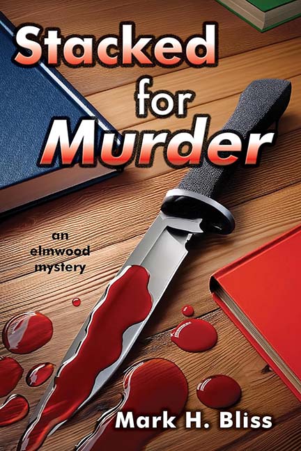
Stacked for Murder — Or Just Stacked for Discount Office Supplies?
Some covers whisper mystery. Some covers drip with menace. And then we have Stacked for Murder, which dribbles what looks suspiciously like strawberry pancake syrup across a knife and calls it a day. Forget CSI — this is IHOP: Special Victims Unit.
Let’s begin with the blood. Murder is supposed to be chilling, visceral, unsettling. But here, the “blood” is so shiny, so artificial, it looks like someone spilled a melted cherry popsicle during finals week. It pools in perfect little red circles, like the aftermath of a toddler’s juice box accident. Crime scene? More like kitchen spill.
And then, the knife. A knife so perfectly polished, so neatly laid down, it doesn’t belong at a murder site — it belongs in a late-night TV infomercial. You half-expect the tagline: “This stainless steel blade slices through tomatoes, rope, and yes, even alibis!”
Now let’s talk about the title font. “Stacked for Murder” is styled in a glowing gradient, the kind of design choice that hasn’t been fashionable since Windows 95 was considered cutting-edge. Add a chunky shadow and what do you get? A title that doesn’t scream “thriller” so much as “8th-grade PowerPoint presentation.”
And finally — the books. Oh, the books. Stacked neatly on a wooden desk, they’re less “crime scene evidence” and more “yard sale leftovers.” Nothing says “tension and danger” like a red binder fresh from Staples and a couple of geometry textbooks.
The only mystery here is how this cover survived the editing process. Or maybe the real crime is aesthetic assault.
Verdict: Stacked for Murder isn’t so much a mystery novel as it is a crime against graphic design.
