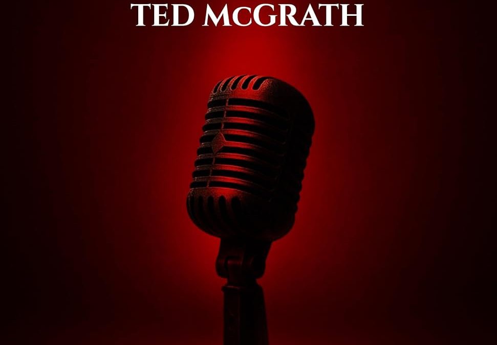

Ah, Stage Empire — where one microphone stands alone, dramatically spotlighted like it’s about to deliver a soliloquy on how it was Photoshopped into this nightmare against its will.
Let’s start with that title font, shall we? It’s giving “Julius Caesar Live at Madison Square Garden.” Nothing says “modern multi-platform storytelling” quite like a serif font that moonlights as the opening credit for a gladiator epic. The whole thing is shouting at us in all caps, because this book has important things to say. Just don’t ask what those things are — the cover won’t tell you. It’s too busy flexing its dramatic lighting.
Speaking of lighting: that crimson glow. Is this a motivational business book or the forbidden karaoke chamber of an underground vampire cabaret? The microphone—bless its basic-stock-image heart—is centered like it’s about to belt out a tortured ballad about being trapped in someone’s self-publishing journey.
And let’s not overlook the tagline:
One Talk. One Story. All Platforms.
This doesn’t read like a promise. It reads like a threat. It’s giving Black Mirror energy. It’s the kind of slogan you’d expect from a dystopian media overlord — not a book presumably about speaking or personal branding (or… something?). There’s no context here, just vague gravitas and a blood-red void.
The whole composition feels like someone Googled “powerful cover” and then said “Yes. But make it weirder.” It’s the visual equivalent of a motivational speaker whispering aggressively at you in a dark room.
At the end of the day, Stage Empire is trying to project dominance and vision, but instead delivers a full-on design existential crisis. If this is an empire, it’s built on Adobe stock images, ominous red light, and fonts that deserve a cease-and-desist.